John A. Frye shares his advice for designing machines with character.
(Image credit: John A. Frye)
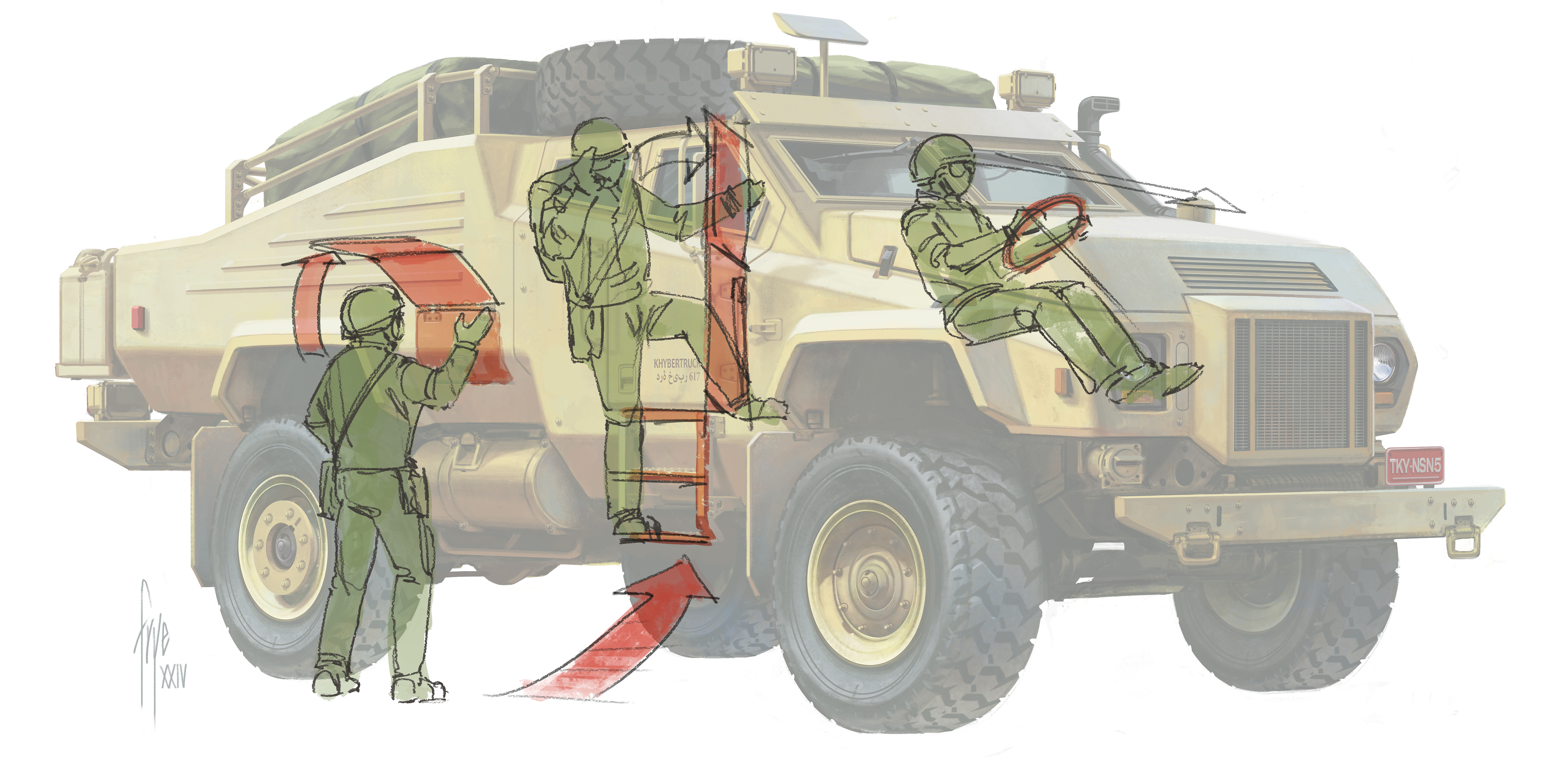
Ships and vehicles are a fascinating area of concept art because they can communicate so much about the world where a game or movie is set. Sometimes vehicle designs can feel cold or uninspired, but I have some favourite techniques for ensuring designs have character and really bring a world to life.
Based in California, John is a specialist in vehicle design, and is also an author and concept art educator. He has a wide-ranging background working within the automotive, film, toy and video games industries.
10 top tips for vehicle and ship design in concept art
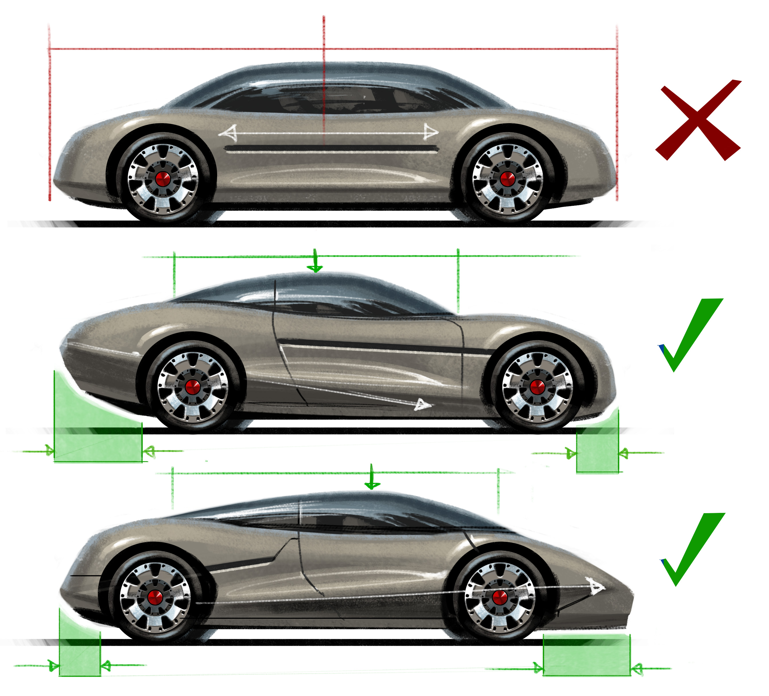
Every vehicle should have a main purpose. Defining what a vehicle does will guide the form, mass and detail to communicate its functional character to the viewer.
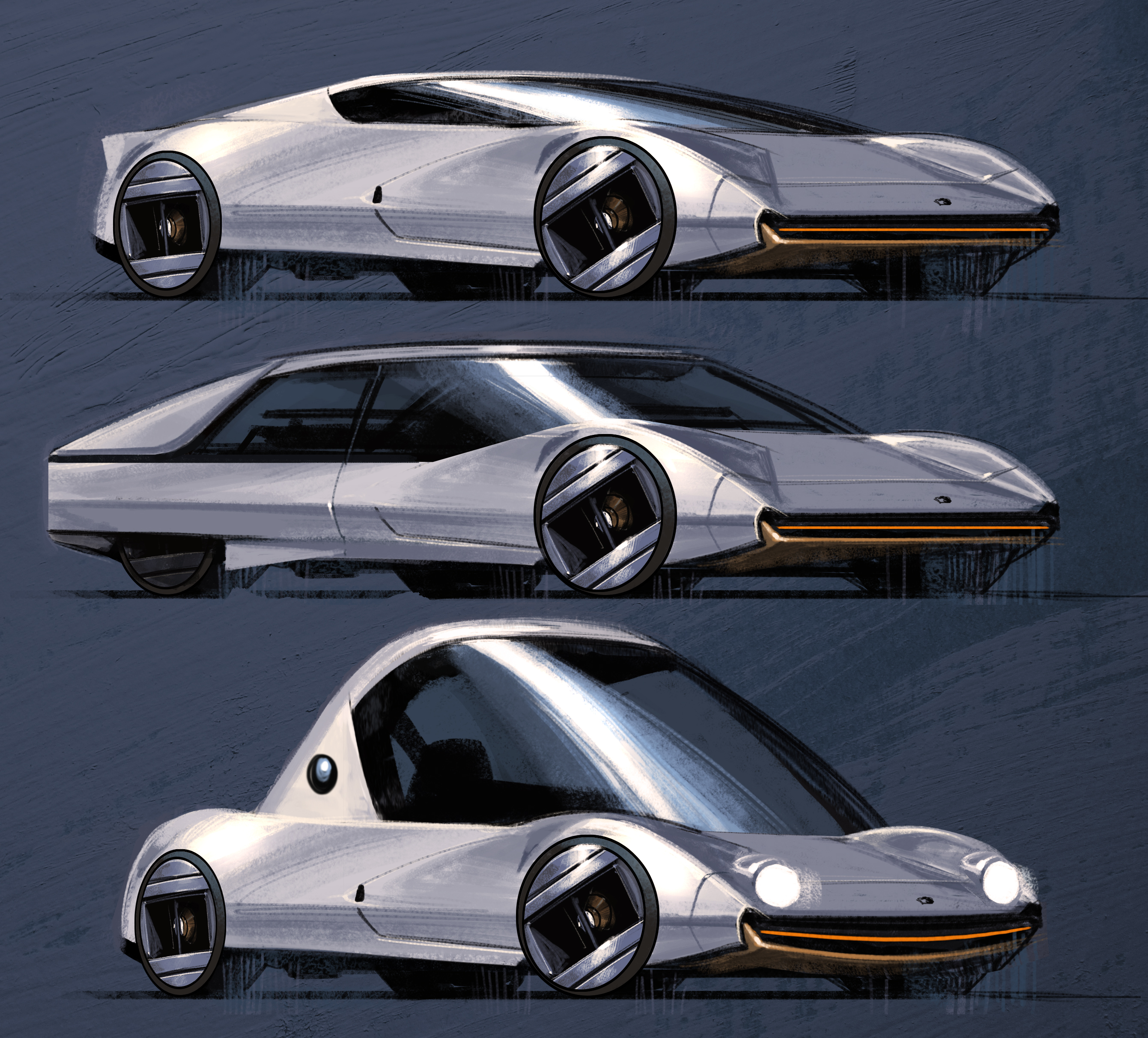
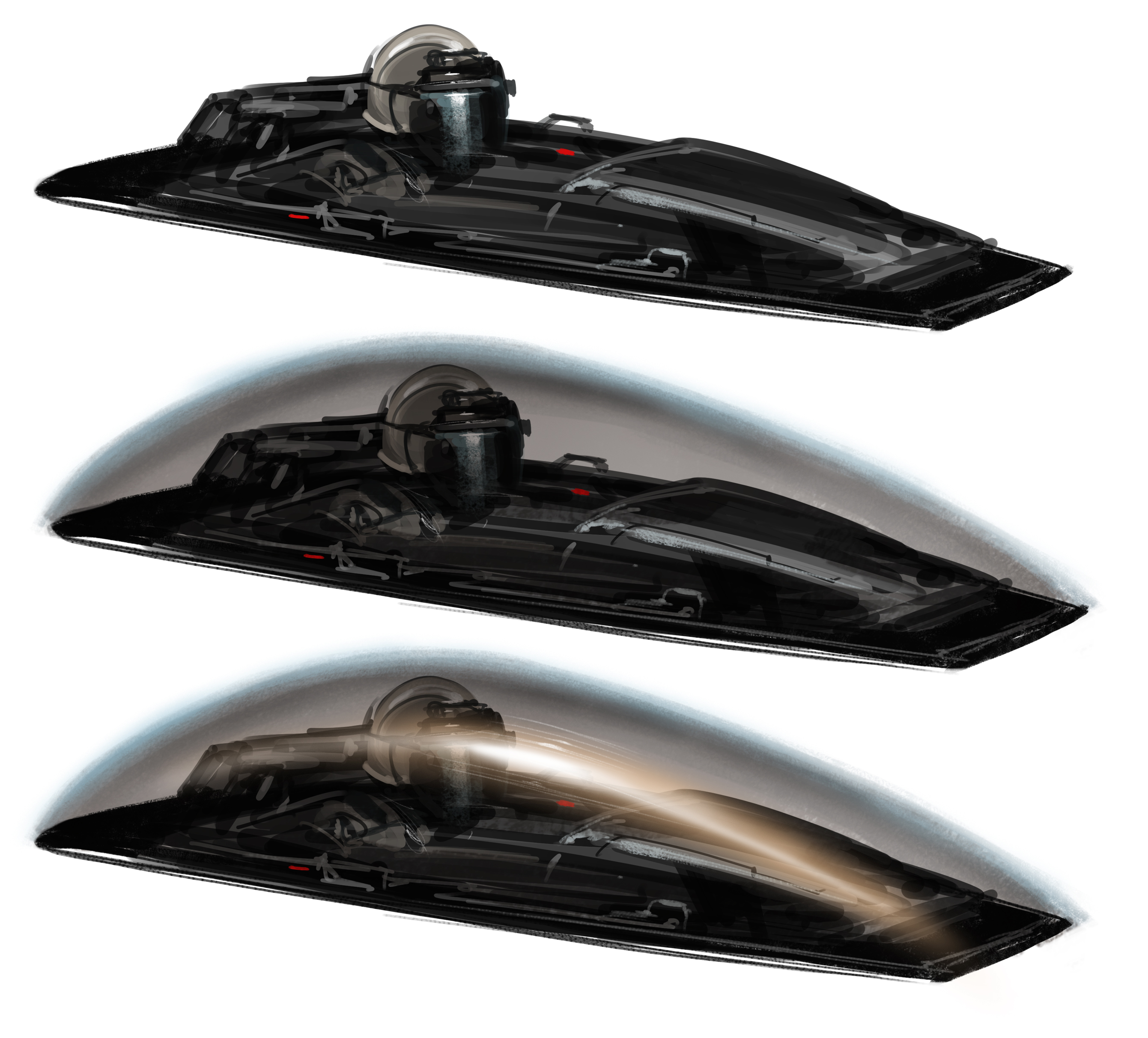
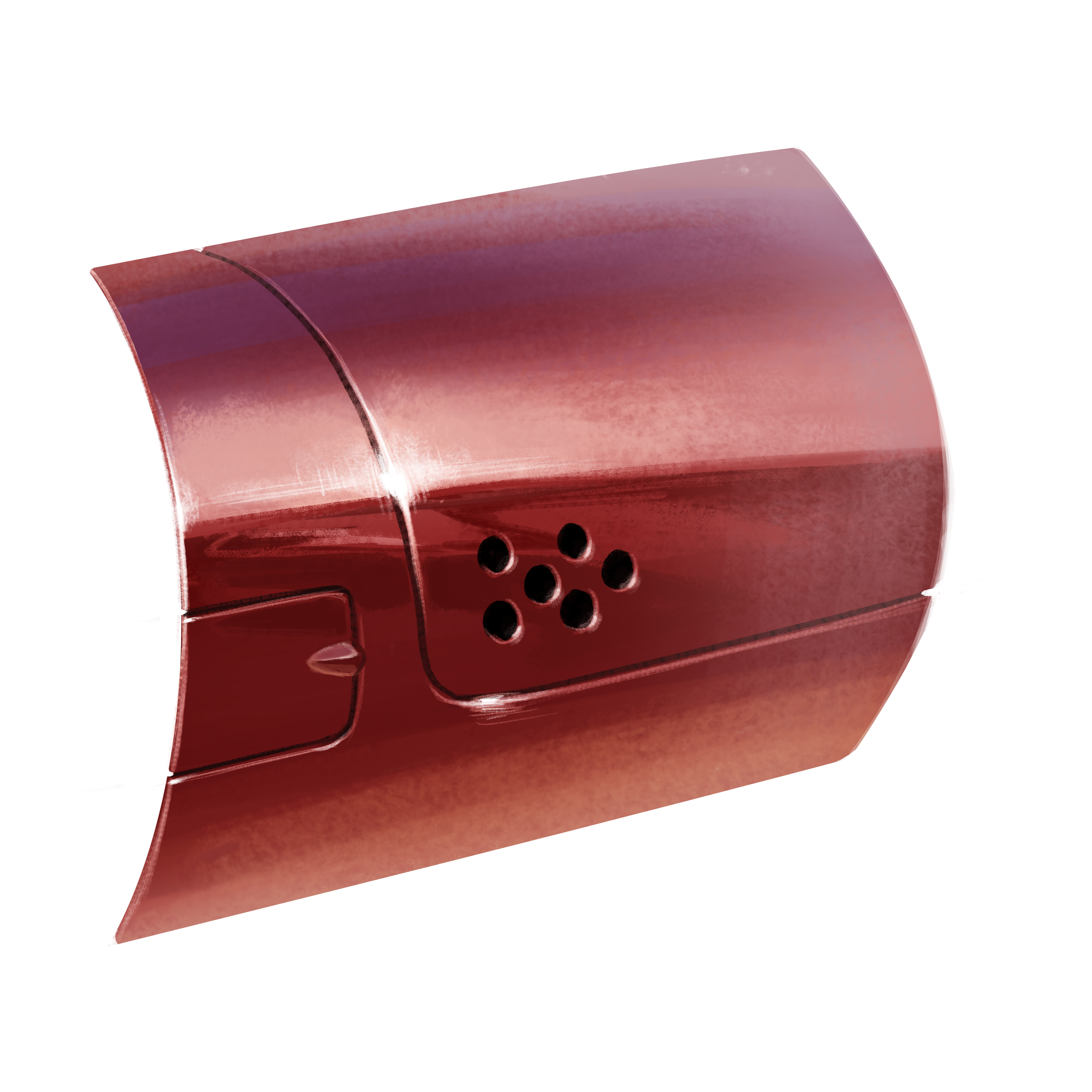
Metallic paint (right) shows more form than solid glossy paint (left). Metallic paint adds tiny flakes that scatter the light to make specular areas brighter and shaded areas darker.
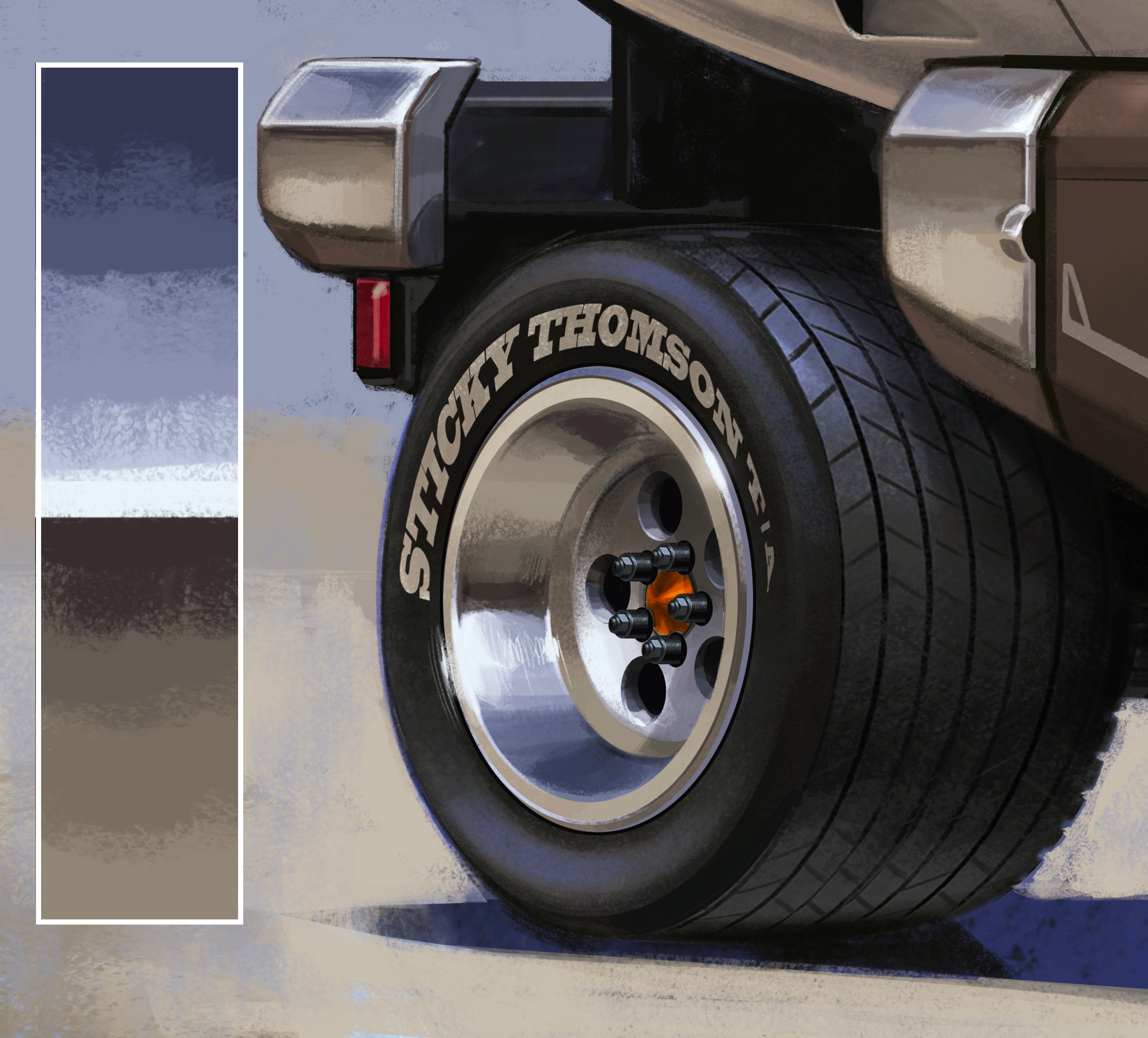
Neutral-toned metal will accurately reflect the sky and ground colour. Avoid a cartoonish look by using desaturated blues and muddier, warmer ground tones.
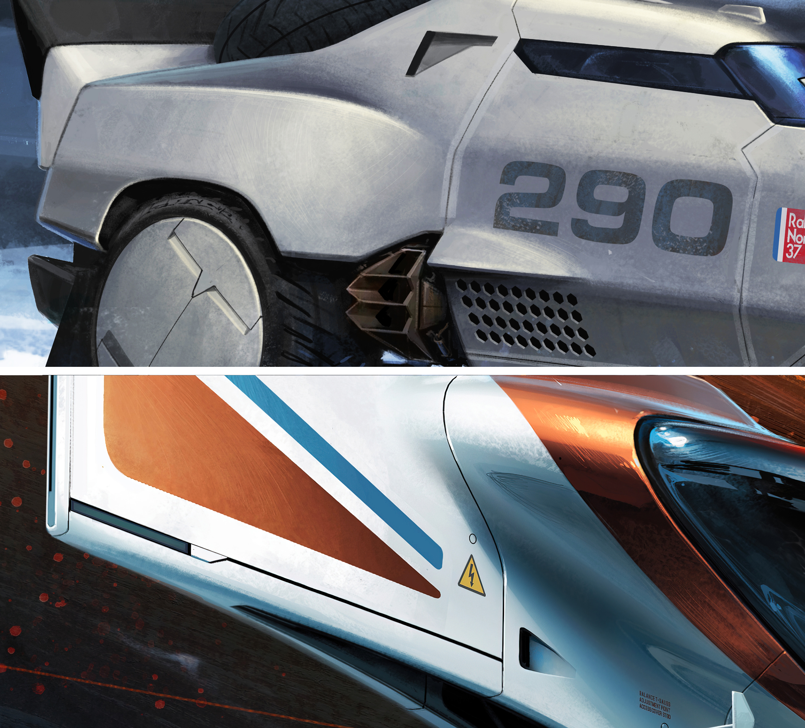
Panels have radiused edges for durability, which catch and stretch highlights. That light spot can bloom, bleeding over the dark gaps between your panels.
Get more tutorials in ImagineFX
This content originally appeared in ImagineFX magazine, the world's leading digital art and fantasy art magazine. ImagineFX is on sale in the UK, Europe, United States, Canada, Australia and more. Limited numbers of ImagineFX print editions are available for delivery from ouronline store (the shipping costs are included in all prices).
Latest Videos From Creative Bloq
Get the Creative Bloq Newsletter
Daily design news, reviews, how-tos and more, as picked by the editors.
Thank you for reading 5 articles this month* Join now for unlimited access
California-based John is a specialist in vehicle design, and is also an author and concept art educator. He has a wide-ranging background working within the automotive, film, toy and video games industries.
You must confirm your public display name before commenting
Please logout and then login again, you will then be prompted to enter your display name.