

Abduzeedo blog feed
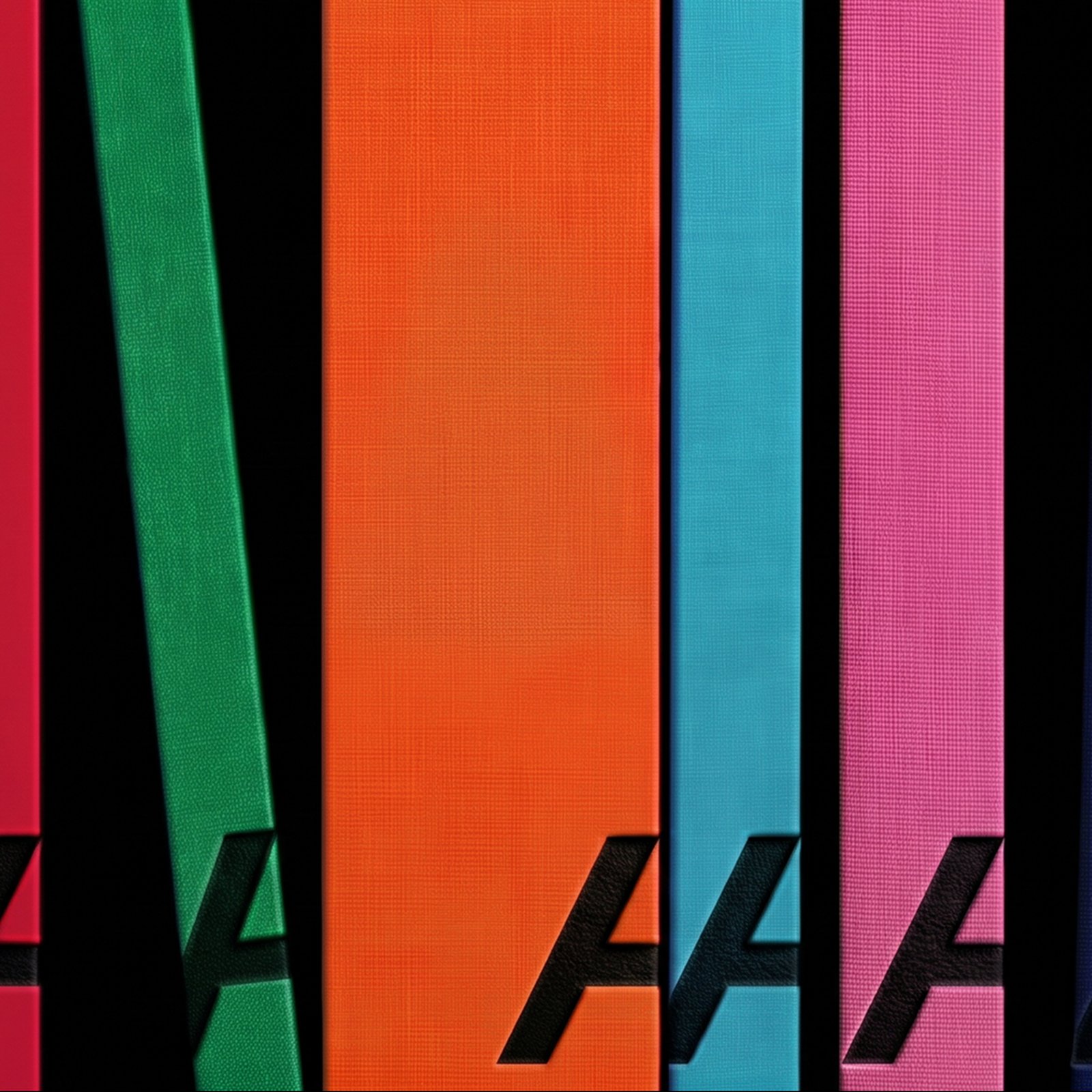
Alianza Rebrand Is a Masterclass in Brand Identity...
Mucho gives the Alianza rebrand an open A: a historic Spanish publisher, recast as a cultural brand in bold color and book design. The first thing you notice is how little the system needs to say. A s...
 5 days ago
7
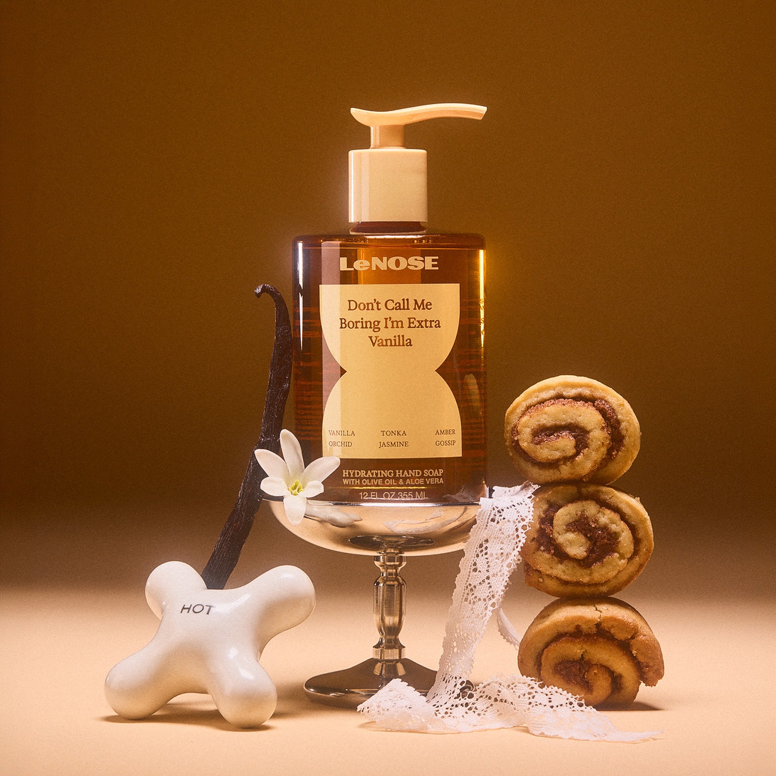
Packaging Design: LeNOSE Fine Fragrance Hand Soap ...
Explore LeNOSE's witty packaging design and fine fragrance development, pairing geometric die-cut labels with $10 luxury hand soaps. Somewhere over the last decade, washing your hands turned into a bi...
5 days ago
5
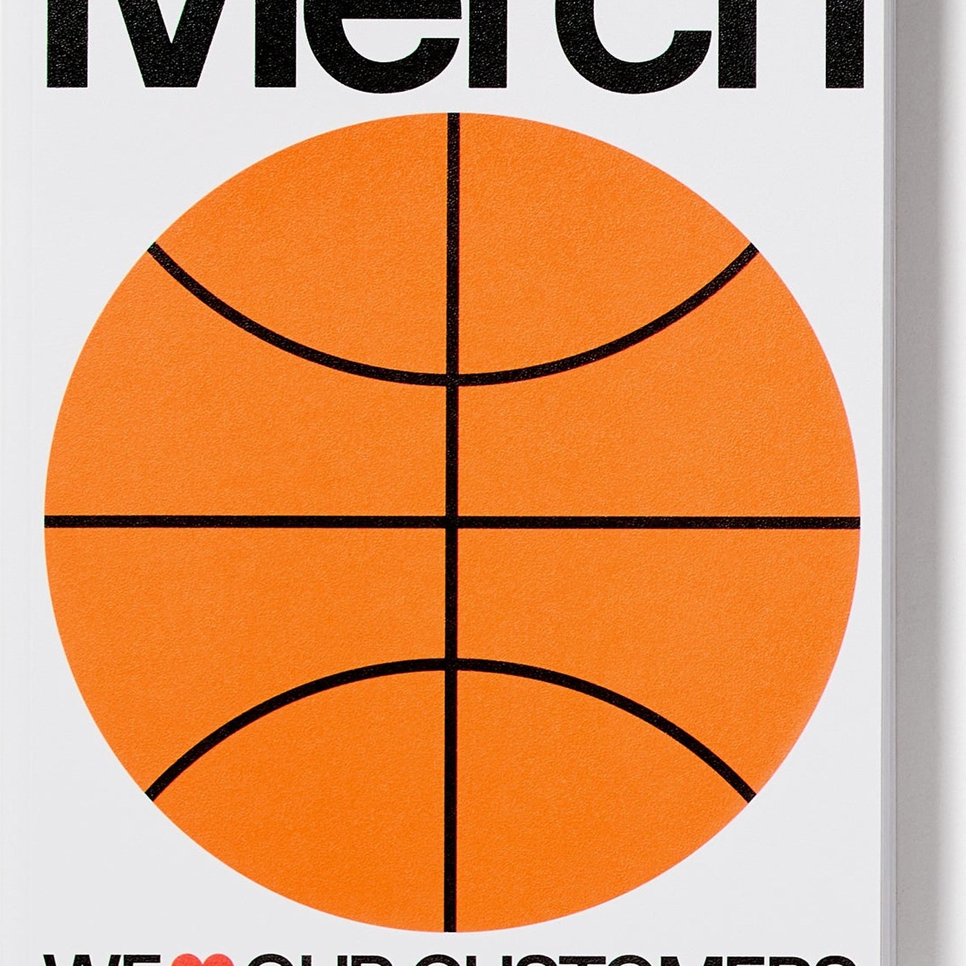
Editorial Design: Merch by Counter-Print
Counter-Print champions physical branding with Merch, an editorial design survey exploring the strategic power of tactile brand collateral. For decades, branded merchandise occupied a strange, slightl...
5 days ago
5
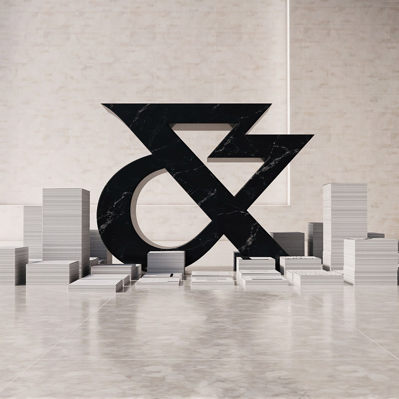
Branding: The White & Case rebrand by Uncommon
Uncommon gives the White & Case rebrand its energy: carved Roman letterforms, kinetic serif headlines, and electric Catalyst Blue. Law firm branding usually plays it safe: sober serif, navy blue, ...
6 days ago
7
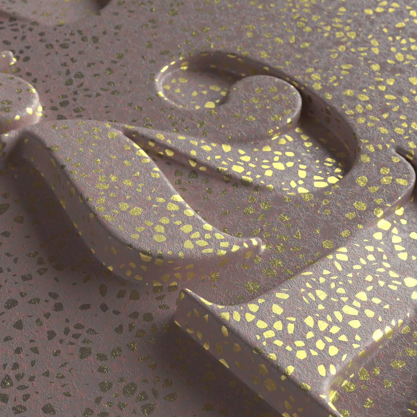
Typography: 3D Embossed Terrazzo by John Kappa
John Kappa explores dimensional typography in Cinema 4D, crafting subtle embossed letterforms directly within polished terrazzo materials. Most digital letterforms rely on crisp fill colors or high-co...
6 days ago
6
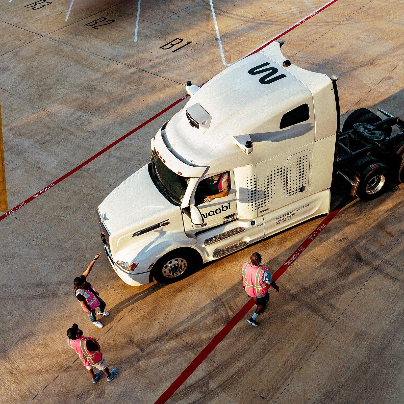
Brand Identity: Waabi Autonomous Trucking by Manua...
Manual crafts a grounded brand identity for physical AI trucking pioneer Waabi, pairing geometric wordmark livery with open-road photography. Autonomous vehicle companies almost always reach for dark-...
6 days ago
5
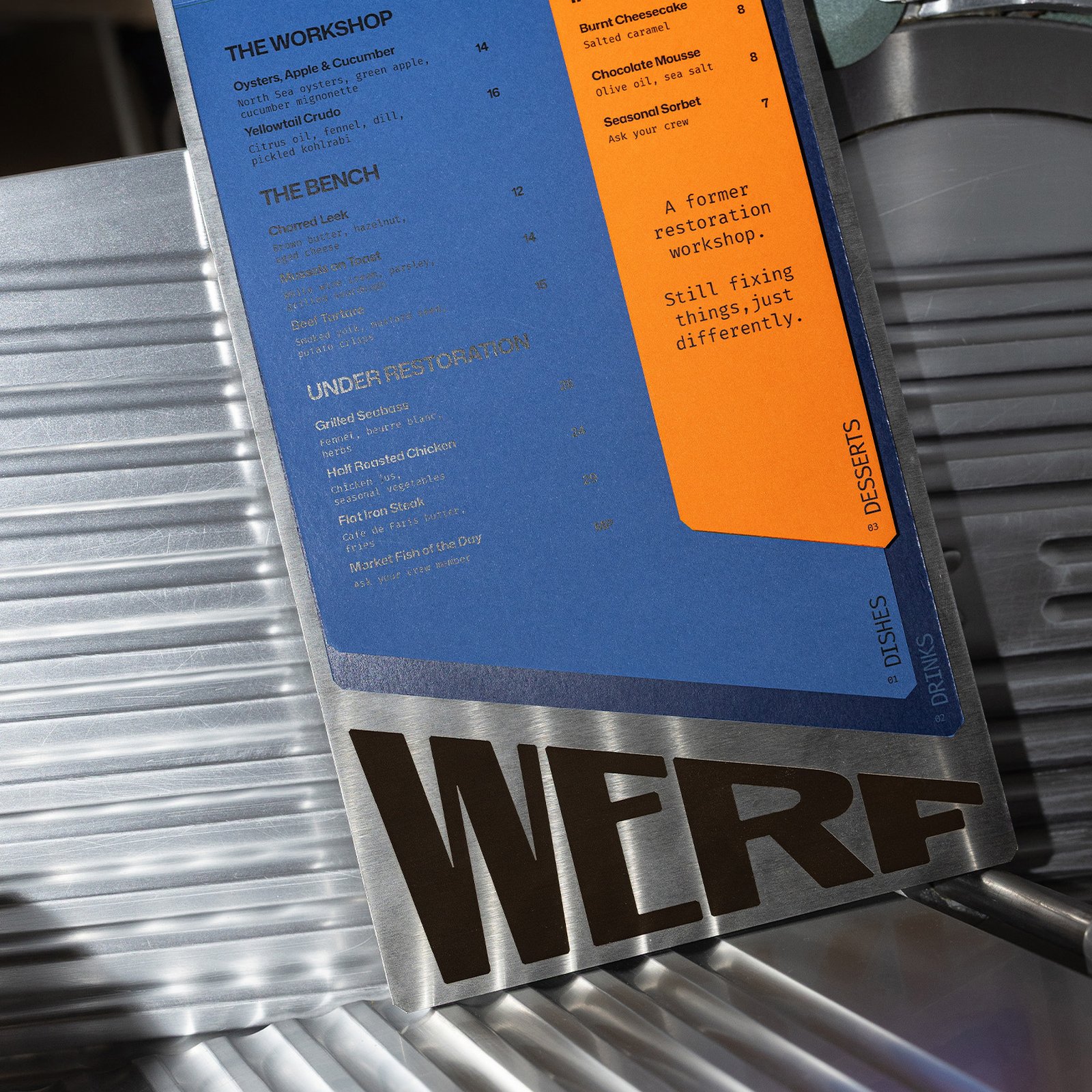
andstudio Unveils the Werf Rotterdam Identity
andstudio built the Werf Rotterdam identity on a shipyard tilt of 20 degrees, so menus, bills, and glasses read as work in progress. Werf is a bar and bistro in Rotterdam, housed in a fully operationa...
6 days ago
6
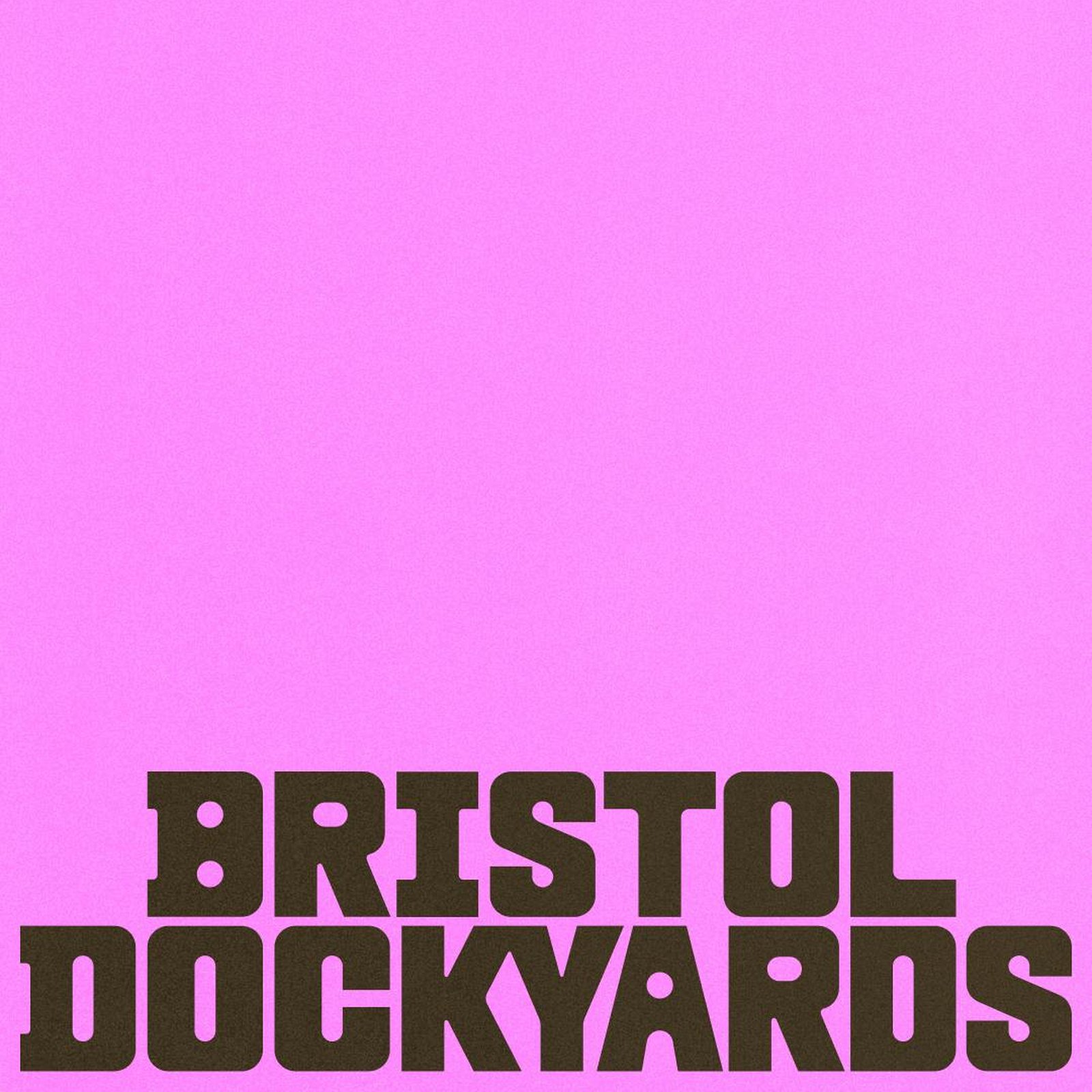
Bristol Dockyards: Inside HOW+HOW's New Branding
HOW+HOW gave Bristol Dockyards a louder name and a collage system from its own history, turning one ship visit into a full cultural destination. The first thing you notice is refusal. Where a maritime...
1 week ago
6
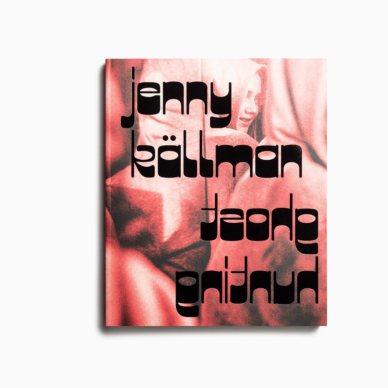
Best of the Week: Mirrored Type, Foil Slipcases, a...
Our curated roundup of the best of the week covers custom grotesks, gold-foiled monographs, and print craft from ISO week 2026-W44. Real craft doesn't need hype. Across the studio releases we studied ...
1 week ago
6
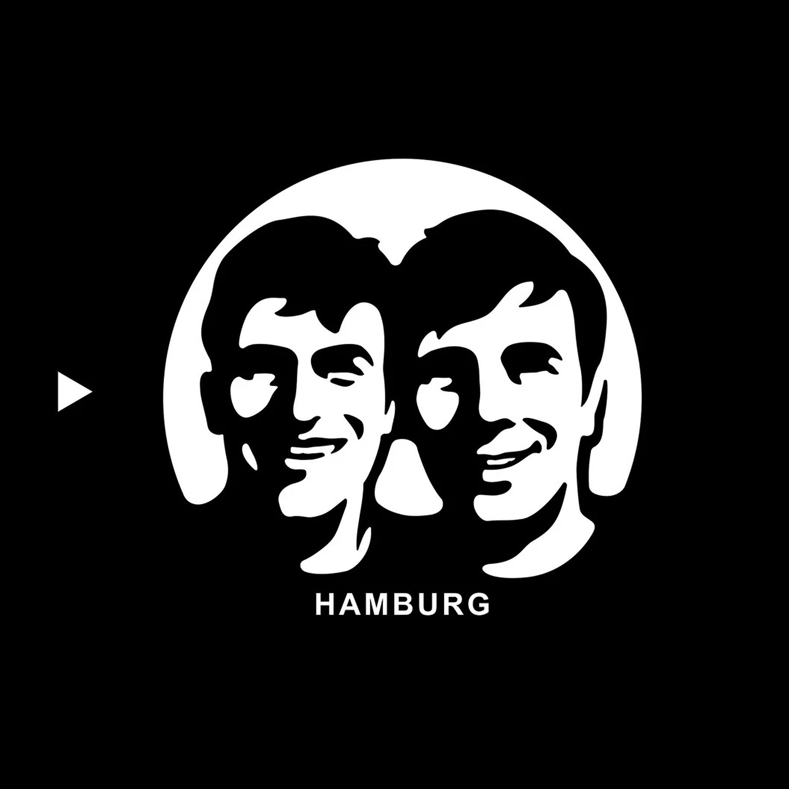
Inside Fritz-Kola: Global Branding by Robot Food
Leeds agency Robot Food evolves Hamburg indie icon Fritz-Kola into a sharp European branding system without losing its counter-culture grit. Scaling a cult drink usually sands off every rough edge tha...
1 week ago
12
Branding: Sundance Film Festival identity by Porto...
Porto Rocha built the Sundance Film Festival identity around a film frame: a bold logo that crops, frames, and carries every story. The first thing you notice is how little the system needs to say. A ...
1 week ago
10
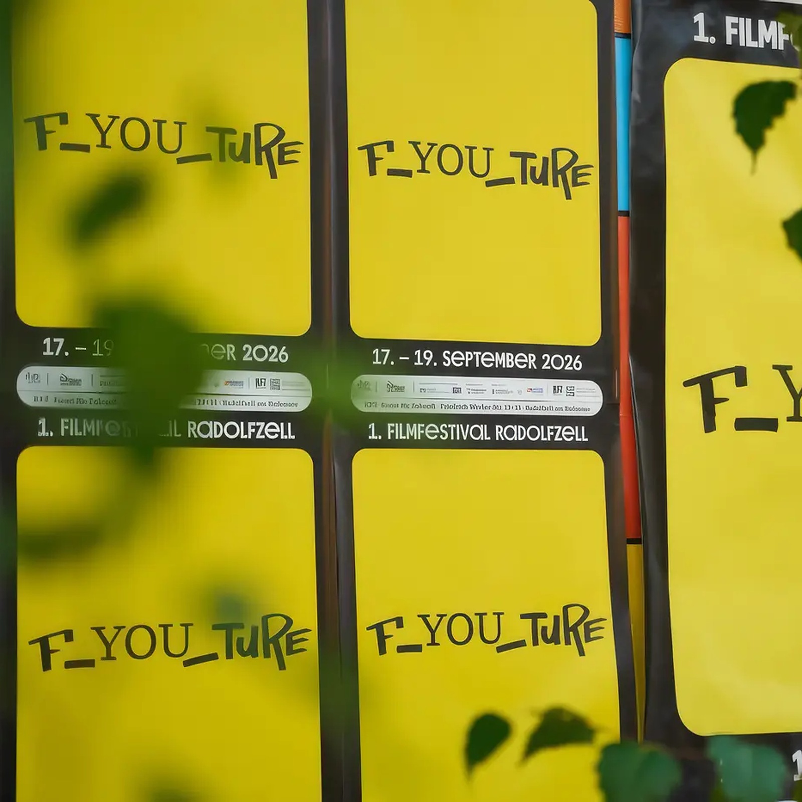
1. Filmfestival Radolfzell: F_YOU_TURE Poster Desi...
Studio Lindhorst-Emme + Hinrichs crafts bold yellow-and-black poster design for 1. Filmfestival Radolfzell and its F_YOU_TURE youth motto. Youth cultural events often get stuck with polite municipal g...
1 week ago
9
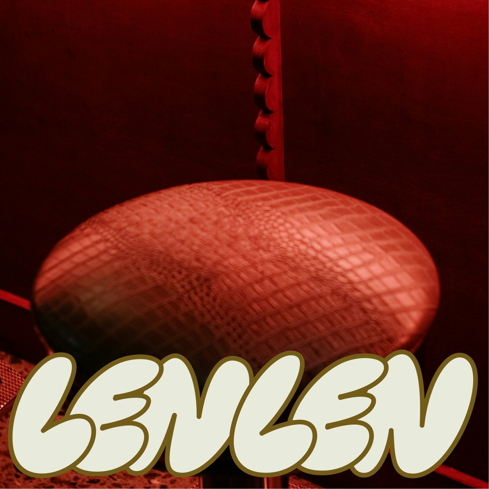
Pentagram Unveils LenLen Branding
Pentagram's LenLen branding turns a Manhattan Thai shophouse into a joke you can read, with bubble letters, loose marker type and a tiger-cat. The idea is simple on purpose. LenLen means just for fun ...
1 week ago
10
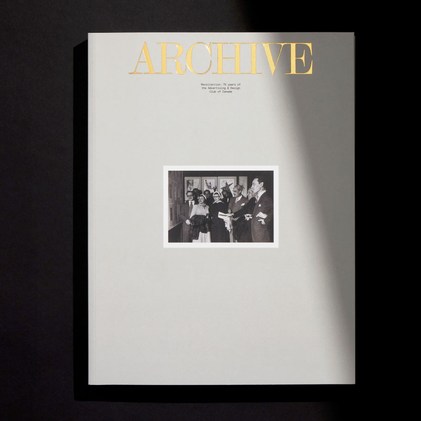
Book Design: Archive/Recollection by Underline Stu...
Underline Studio crafts the 75th-anniversary ADCC book design for Archive/Recollection, pairing a gold-foiled slipcase with vermilion grids. Institutional anniversary books usually gather dust on agen...
1 week ago
21
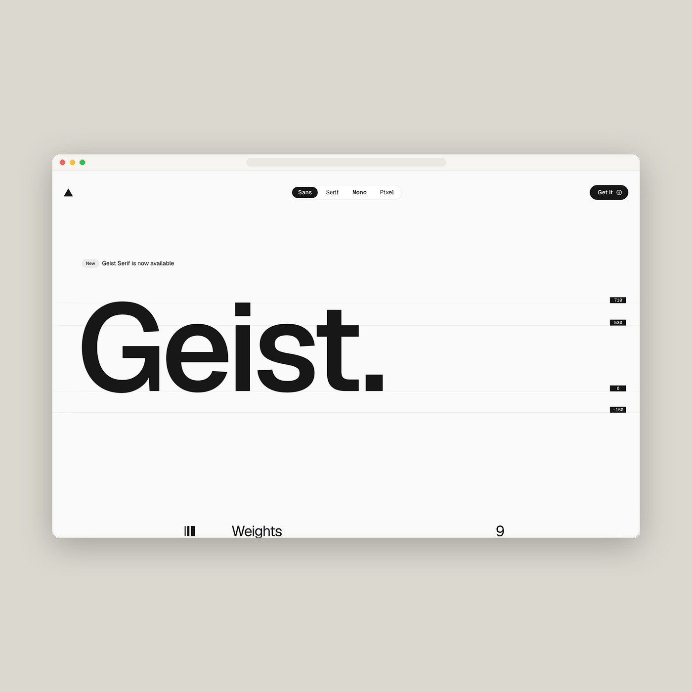
Web Design: The Geist Font Specimen by Vercel
Vercel crafts a benchmark in web design with the interactive Geist font specimen, pairing Swiss precision with developer-grade typography. Typography specimen websites usually fall into one of two tra...
1 week ago
18
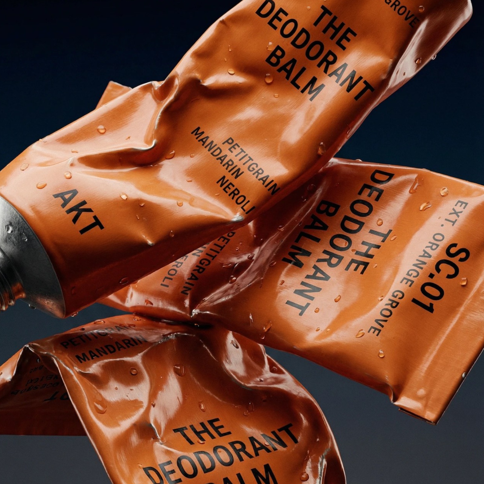
AKT London: Inside Two Times Elliott’s Visual Iden...
Two Times Elliott channels West End theater marquees into a plastic-free visual identity and aluminum tube system for AKT London. Natural deodorant brands almost always hide behind pale kraft paper an...
1 week ago
7
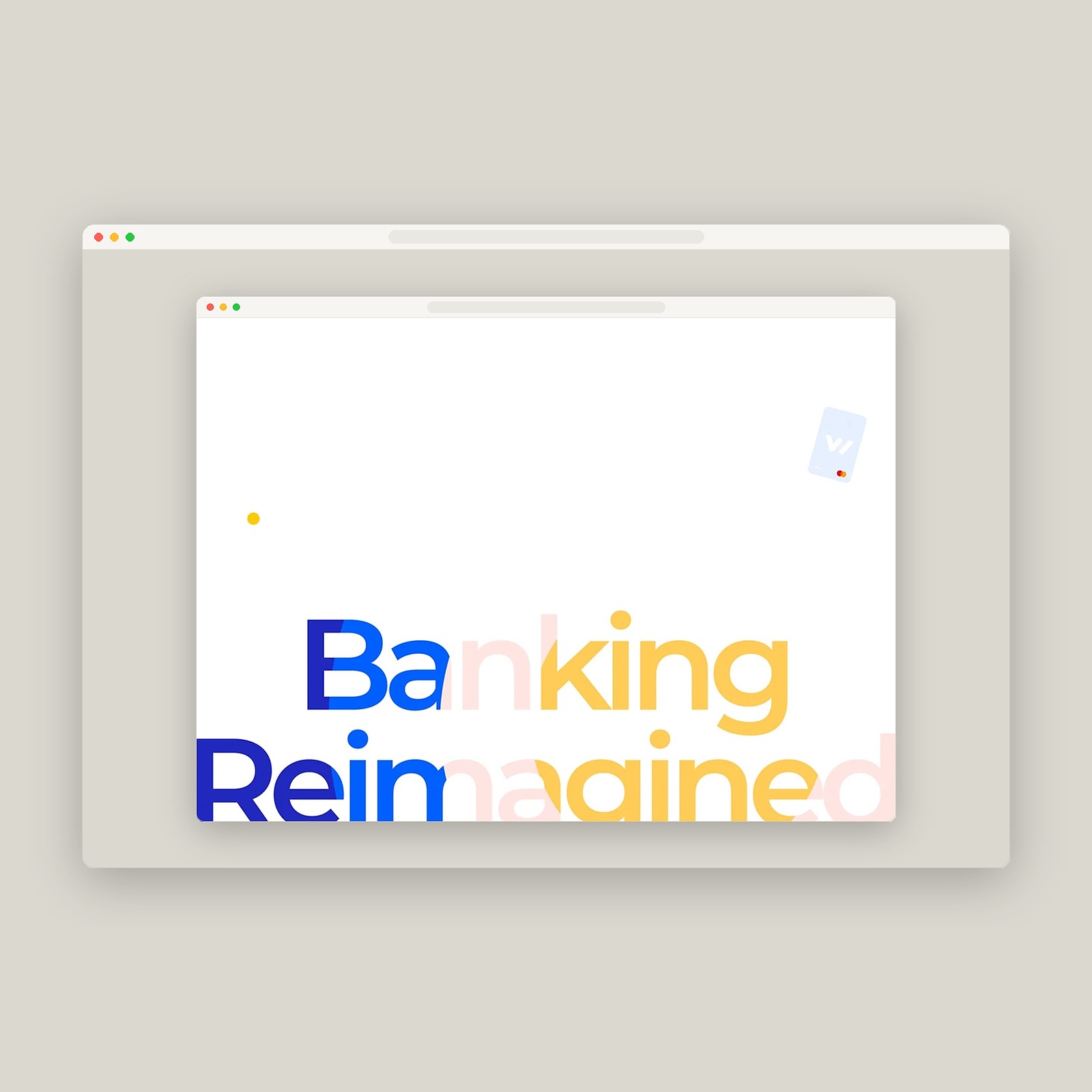
Cuberto Unveils Wickret UI/UX Design & Mobile Bank...
Cuberto crafts the UI/UX design for fee-free mobile bank Wickret, pairing Montserrat type grids with color-blocked wallet cards and motion. Most mobile banking apps look like dressed-up spreadsheets. ...
1 week ago
9
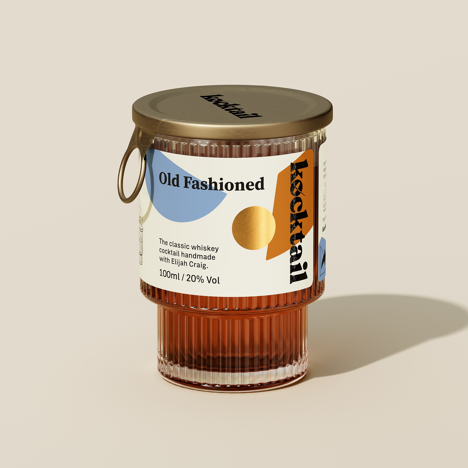
Packaging Design: Kocktail Reusable Glass on Dieli...
Kocktail trades disposable RTD cans for reusable fluted rocks tumblers, pairing ring-pull brass lids with clean-peel packaging design. Aluminum cans kill bar rituals. Pre-mixed drinks save sourcing ha...
1 week ago
17
Popular
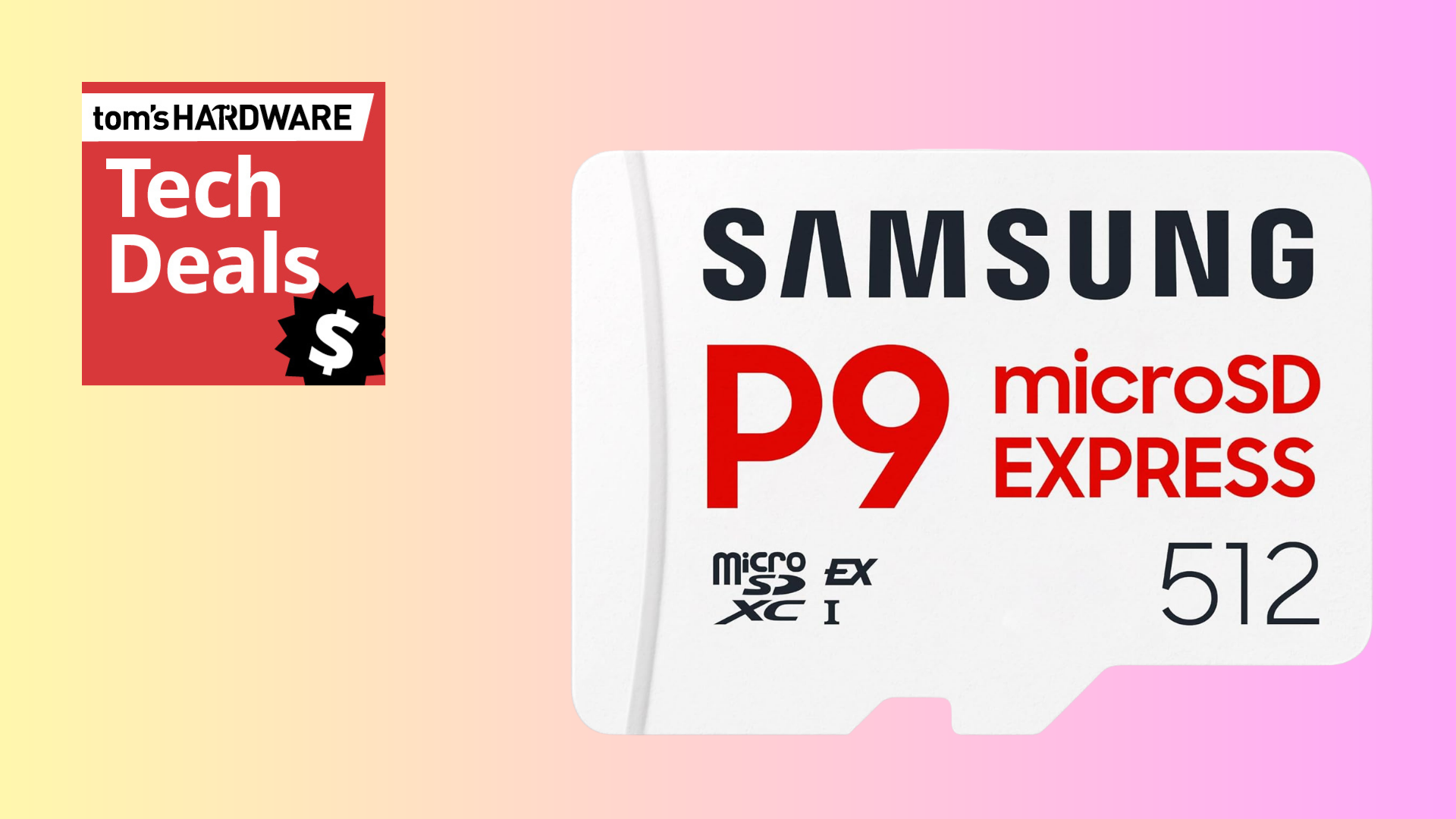
Triple your Nintendo Switch 2's storage for just $99



 English (US) ·