

Abduzeedo blog feed
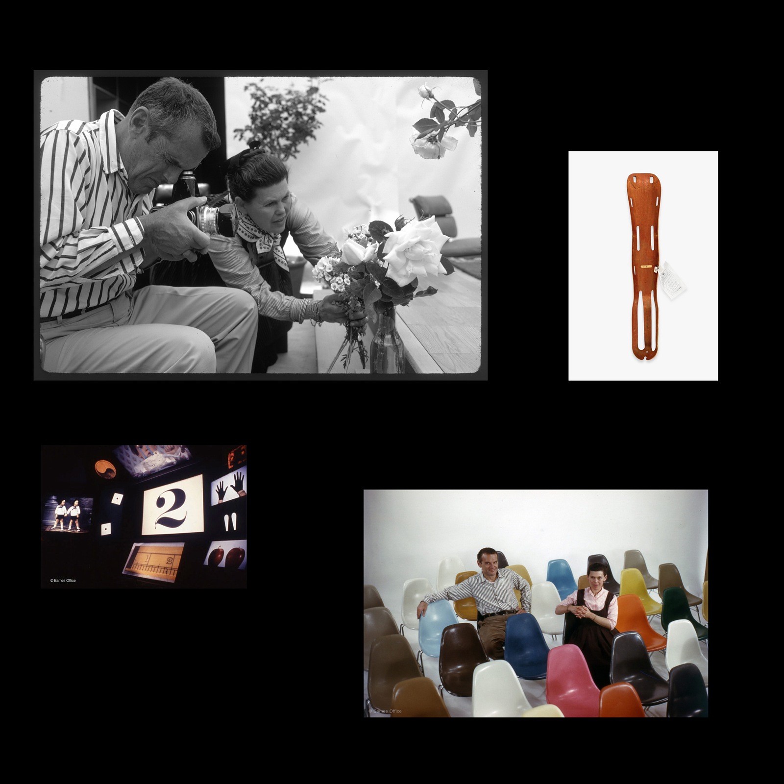
Brand Identity: Eames Institute by Manual
San Francisco studio Manual builds a living brand identity for the Eames Institute of Infinite Curiosity, pairing archival type with the curious e. Designing for Ray and Charles Eames is a massive tra...
 1 week ago
23
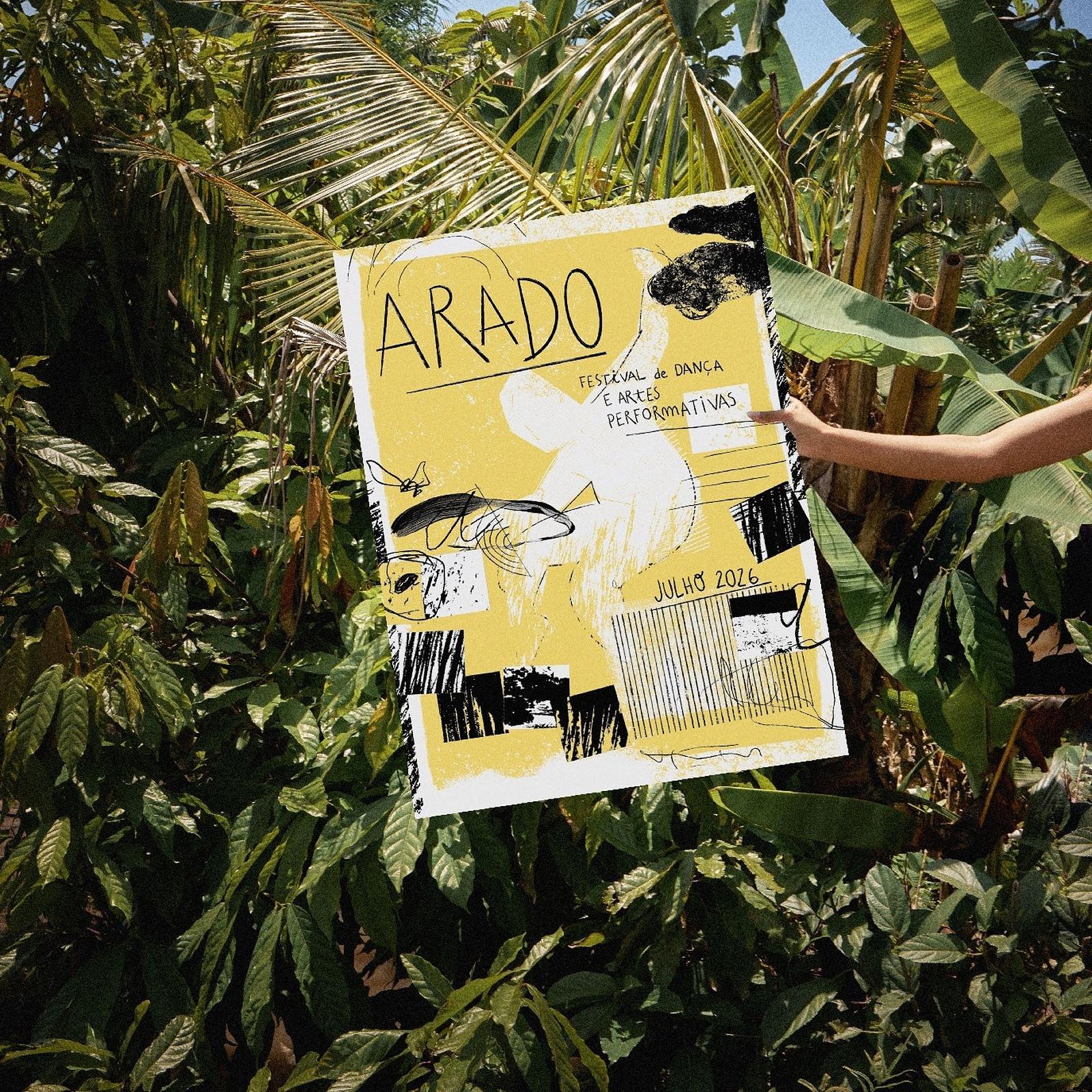
Inside Senhor Paulinho’s Brand Identity for Arado ...
Arado 2026 by Senhor Paulinho is a brand identity system for Madrasta Dance built on hand-drawn typography, ink textures, and yellow posters. Portuguese graphic designer Paulo Graça (known as Senhor P...
1 week ago
18
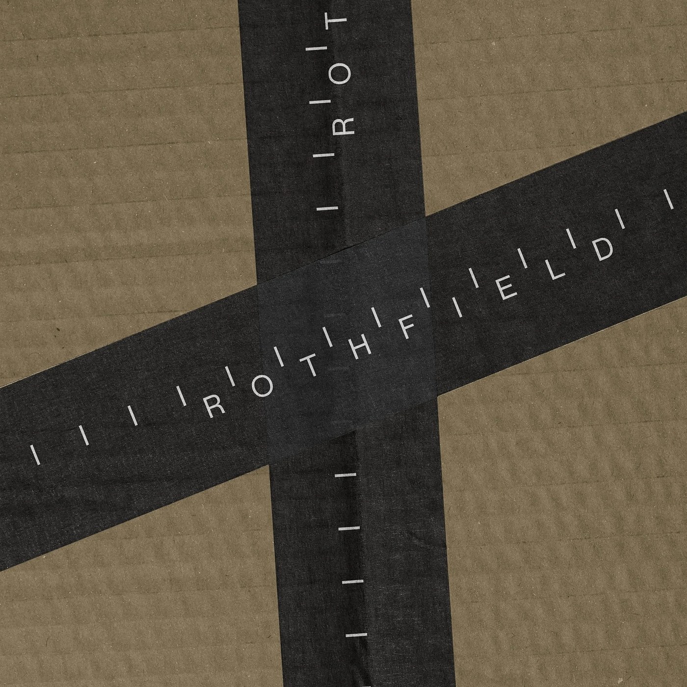
Brand Identity: Rothfield by Studio Julius
Studio Julius builds a calibrated brand identity, custom 16-unit icon system, and tactile studio tools for Australian partner Rothfield. Working behind the scenes rarely gets the spotlight. For decade...
1 week ago
15
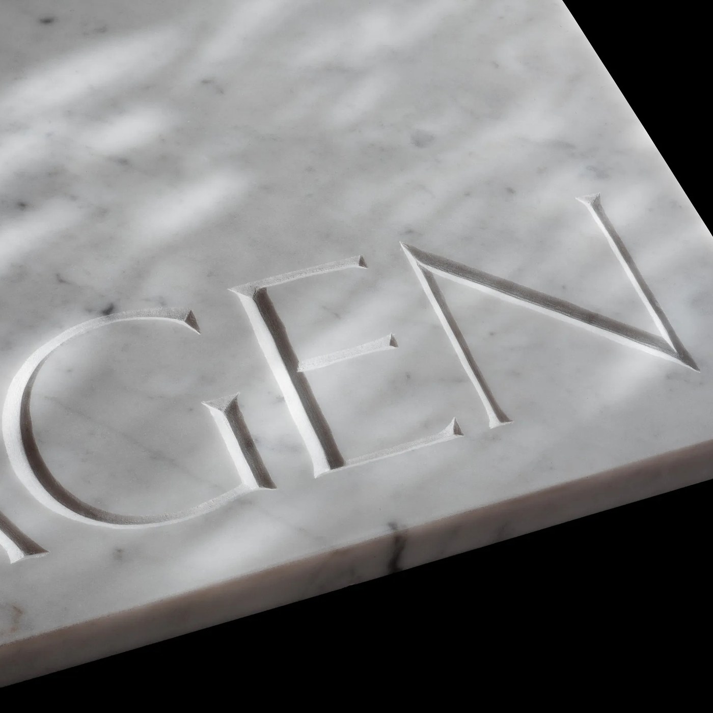
Typography: Exemplar by Letters from Sweden
Letters from Sweden has unveiled Exemplar, an expansive multi-script typography family thirty years in the making and carved into Italian Carrara marble. In 1994, type designer Göran Söderström began ...
1 week ago
19
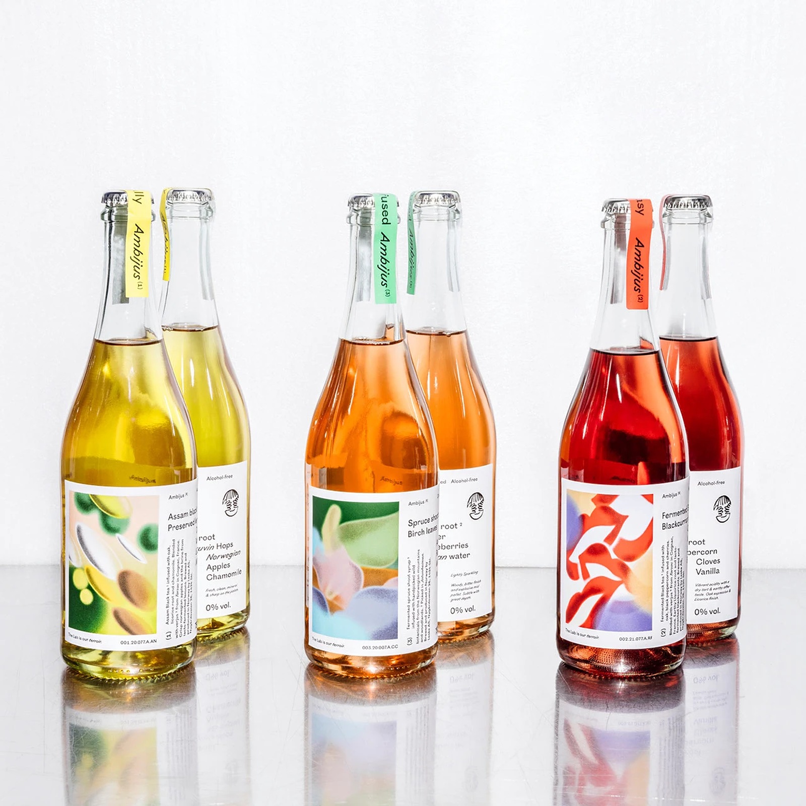
Best of the Week: Monospaces, Engraved Cotton, and...
Our curated roundup of the best of the week covers open-source monospaces, cotton stationery, and tactile books from ISO week 2026-W43. Good design doesn't need a thirty-page strategy deck to explain ...
2 weeks ago
21
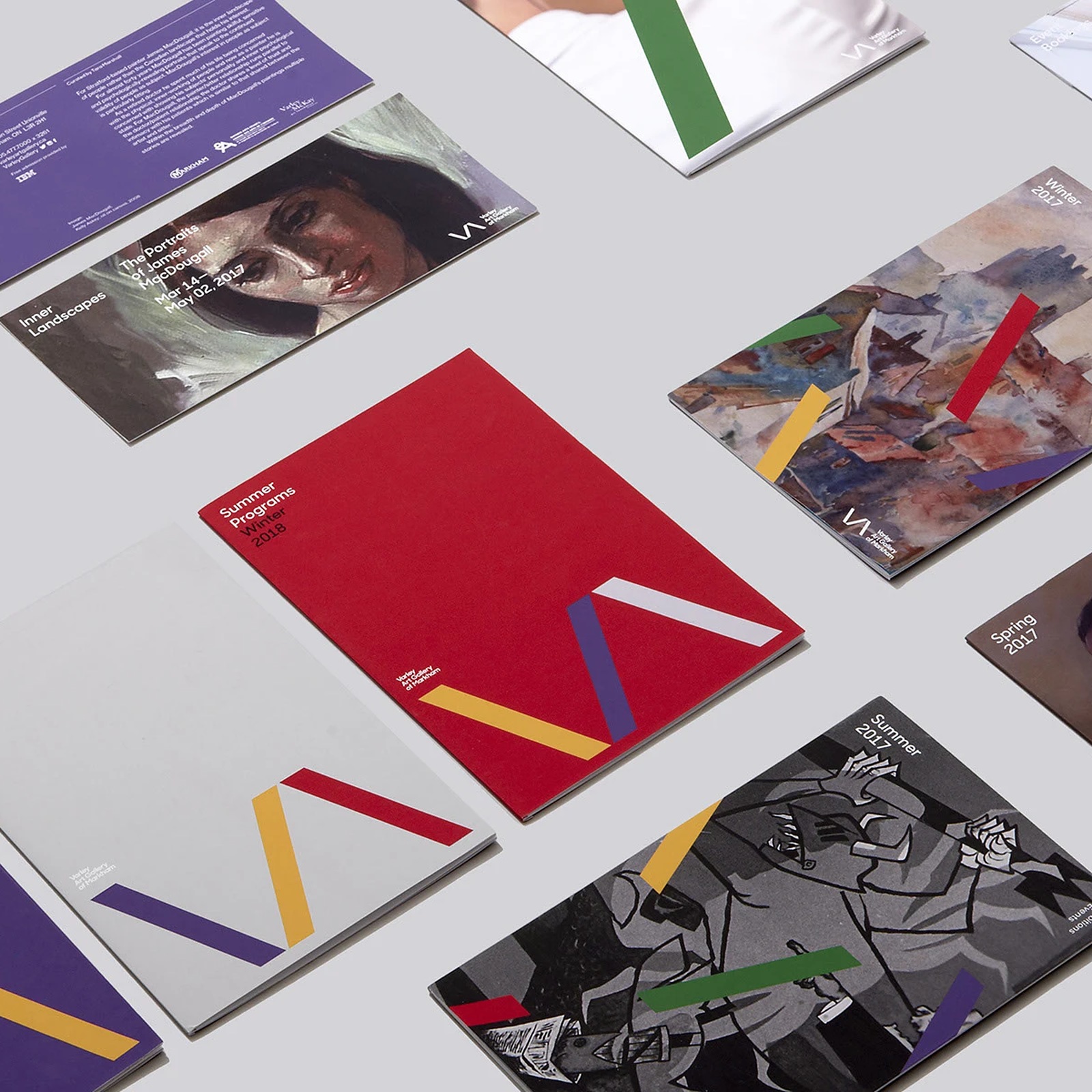
Inside Varley Art Gallery: Branding by Underline S...
Explore the Varley Art Gallery of Markham branding by Underline Studio, built around a deconstructed VA monogram and bold print system. Regional art museums often trap themselves in quiet, neutral gre...
2 weeks ago
8
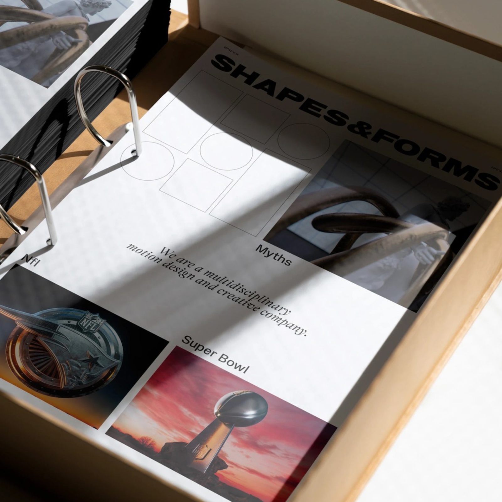
How Florian Cornut Crafted Graphic Design for Shap...
Explore the Shapes & Forms graphic design system by Florian Cornut, pairing Vinila and GT Alpina Fine type across print and stationery. Look closely at the stationery flat lay for Shapes & For...
2 weeks ago
10
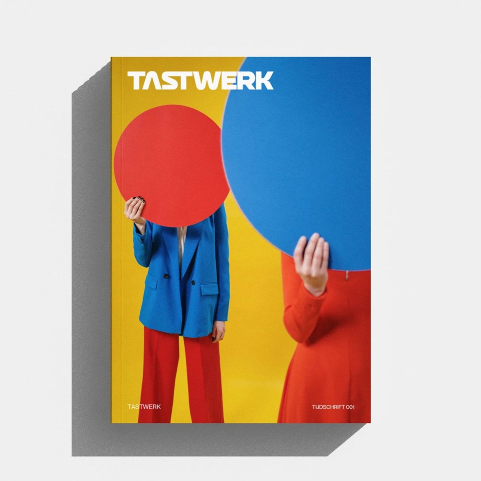
TASTWERK Tijdschrift 001: Editorial Design by Wess...
Explore the TASTWERK Tijdschrift 001 editorial design by Wessam Hussien, pairing a six-column InDesign grid with primary-color studio studies. Most studio monographs only show the polished final objec...
2 weeks ago
9
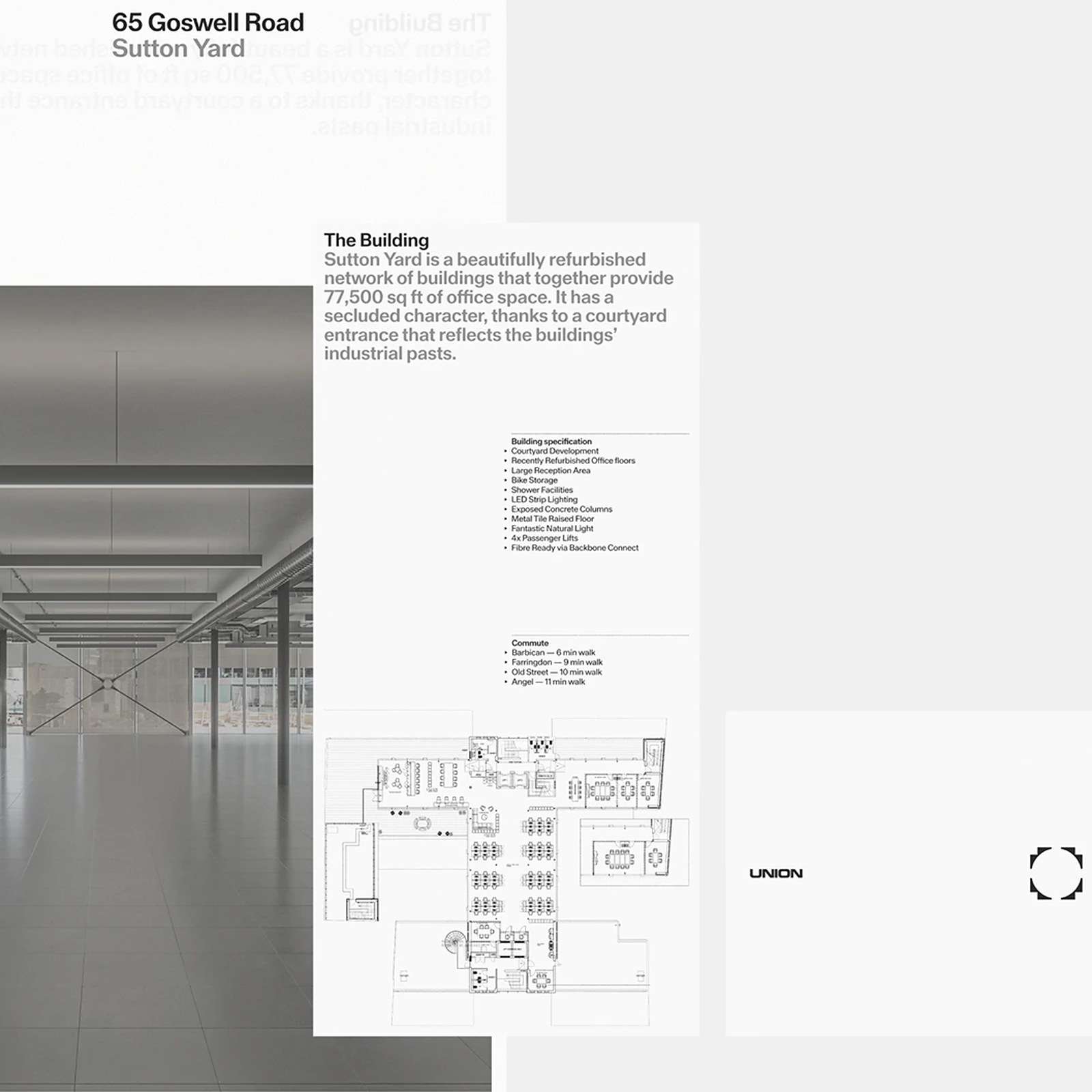
Union: Inside Two Times Elliott’s Visual Identity
Explore the Union visual identity by Two Times Elliott, pairing extended grotesk typography and Swiss grids with tactile print monographs. Office branding usually tries way too hard. Over the past fif...
2 weeks ago
10
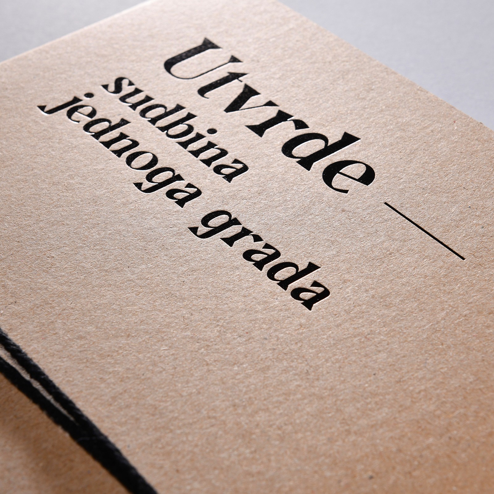
Editorial Design: Fortresses by Studio Tumpić/Pren...
Studio Tumpić/Prenc turned a scientific catalogue into a naval officer's file: editorial design in kraft paper, binding cord, and archival tabs. The book documents Pula's 19th and early 20th century f...
2 weeks ago
10
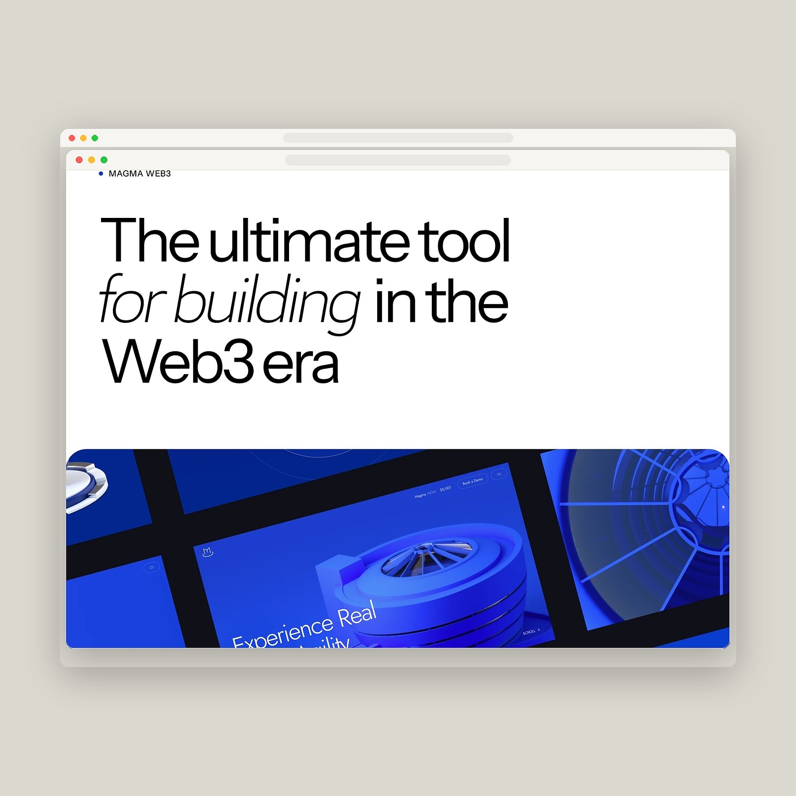
Cuberto Unveils Magma Web Design & Interactive 3D ...
Explore the Magma web design by Cuberto, pairing Jost typography and #0F4BFD cobalt screens with Blender GLTF 3D building twins and GSAP. Real estate platforms almost always look like spreadsheet soft...
2 weeks ago
9
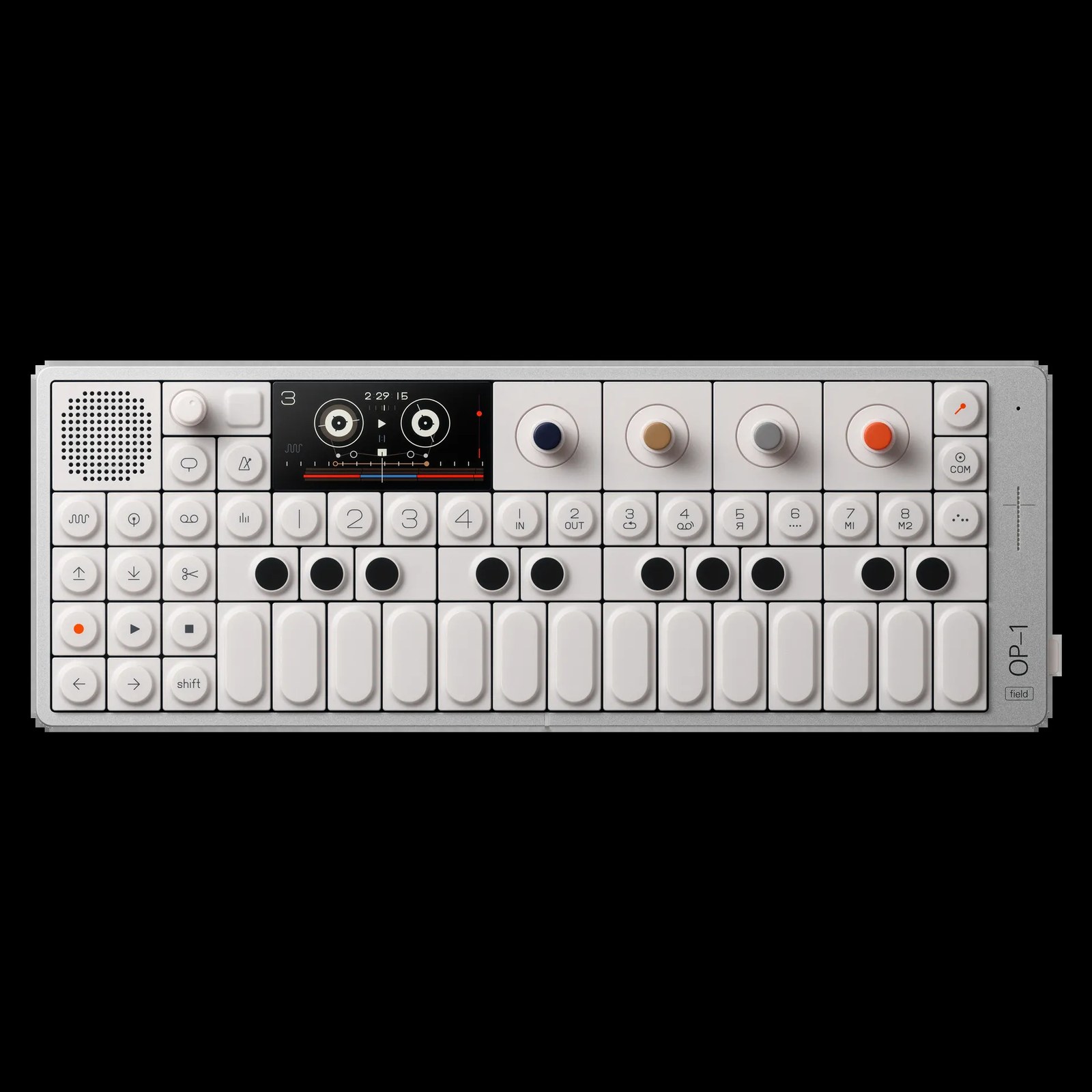
Teenage Engineering Is a Masterclass in Product De...
Teenage Engineering designs music gear like precision lab instruments: aluminum bodies, labeled controls and color used strictly as code. Start with the OP-1 field. It is a white aluminum slab, 300 mi...
2 weeks ago
12
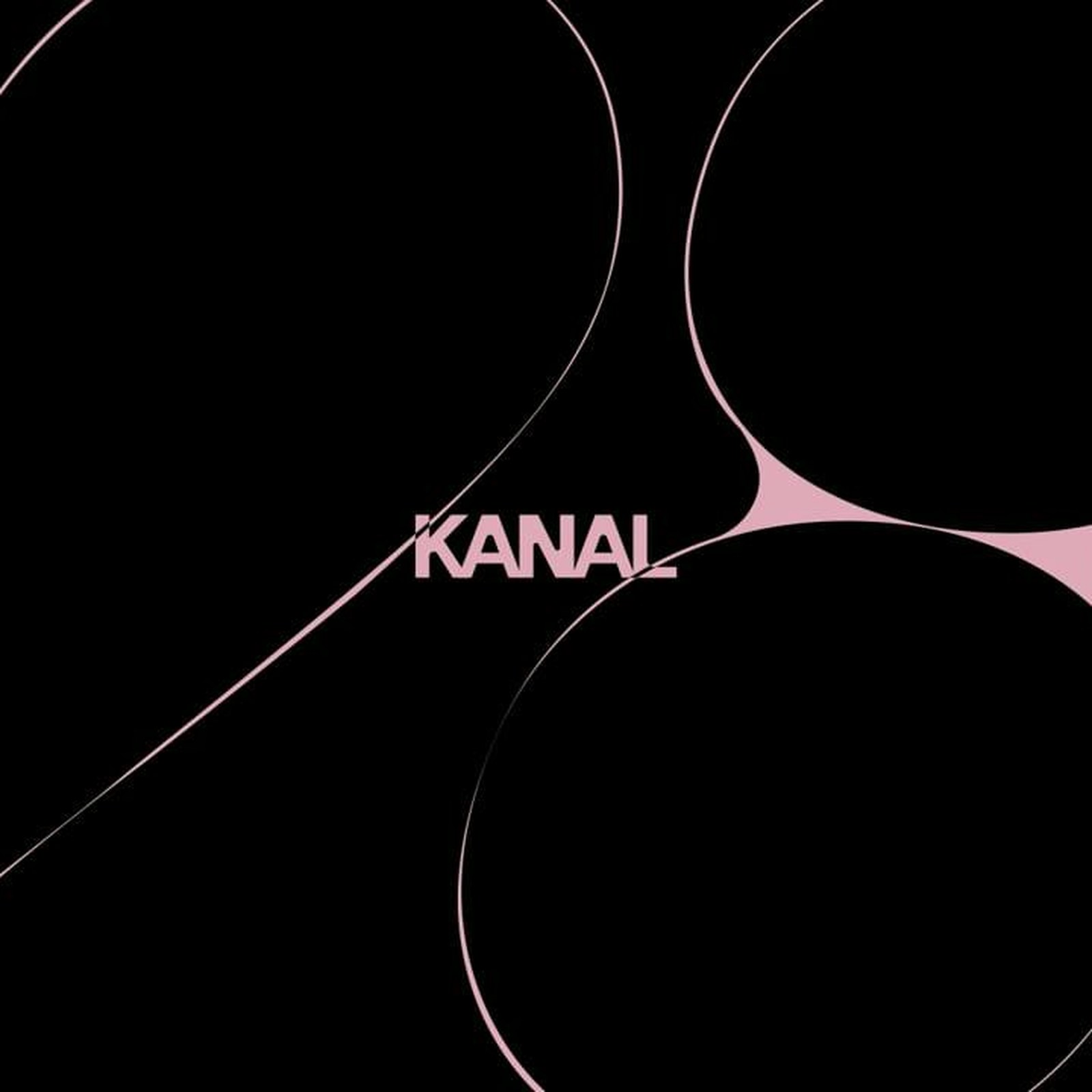
How Base Design Reimagined the Kanal Centre Pompid...
Base Design built the Kanal Centre Pompidou identity on a variable typeface that breathes, flows and overflows, opening November 2026. The first thing you notice is how little of the system sits still...
2 weeks ago
10
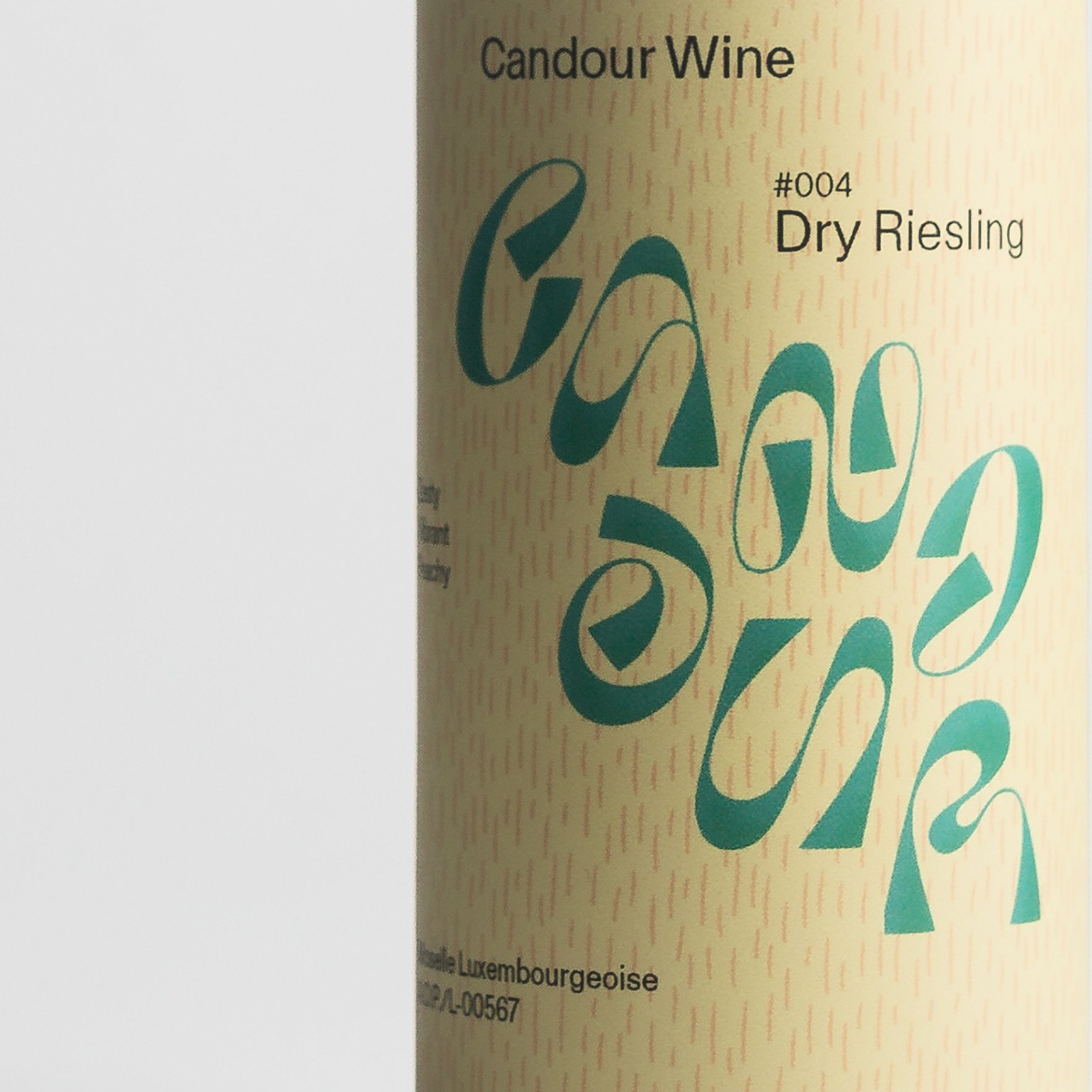
Packaging Design: Candour Wine by Bedow
Explore the Candour Wine packaging design by Bedow, pairing a flavor-responsive variable wordmark with tactile labels on recyclable cans. Traditional wine labels love hiding behind faux-chateau crests...
2 weeks ago
14
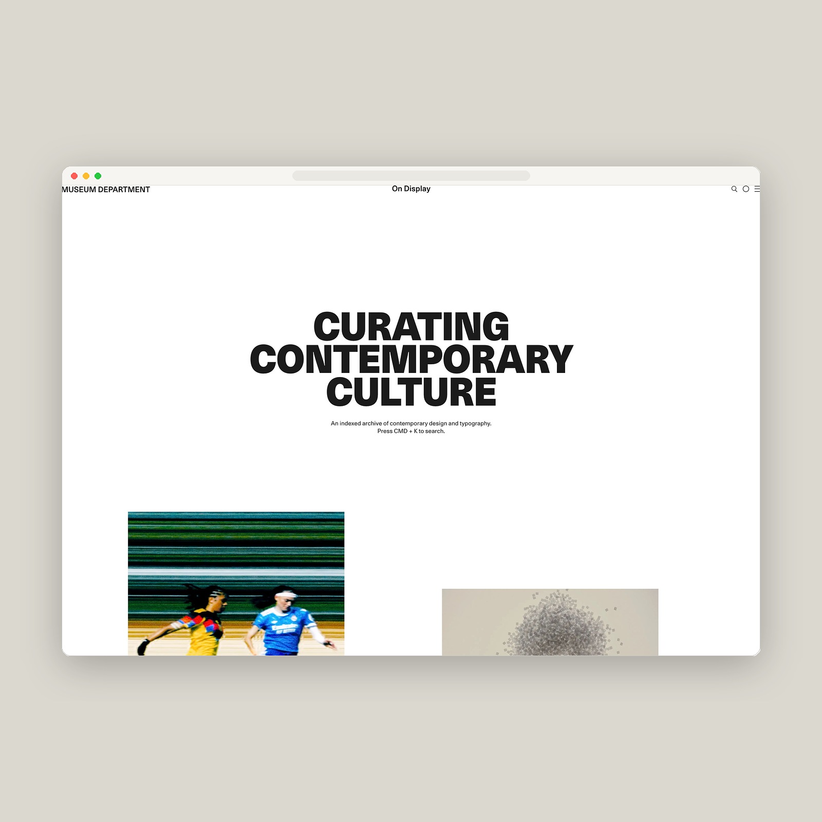
Web Design: Museum Department Contemporary Archive...
Explore Museum Department, an interconnected web design archive linking contemporary graphic design, type foundries, fonts, and studios. Most design blogs suffer from the same quiet decay. A studio sp...
2 weeks ago
14
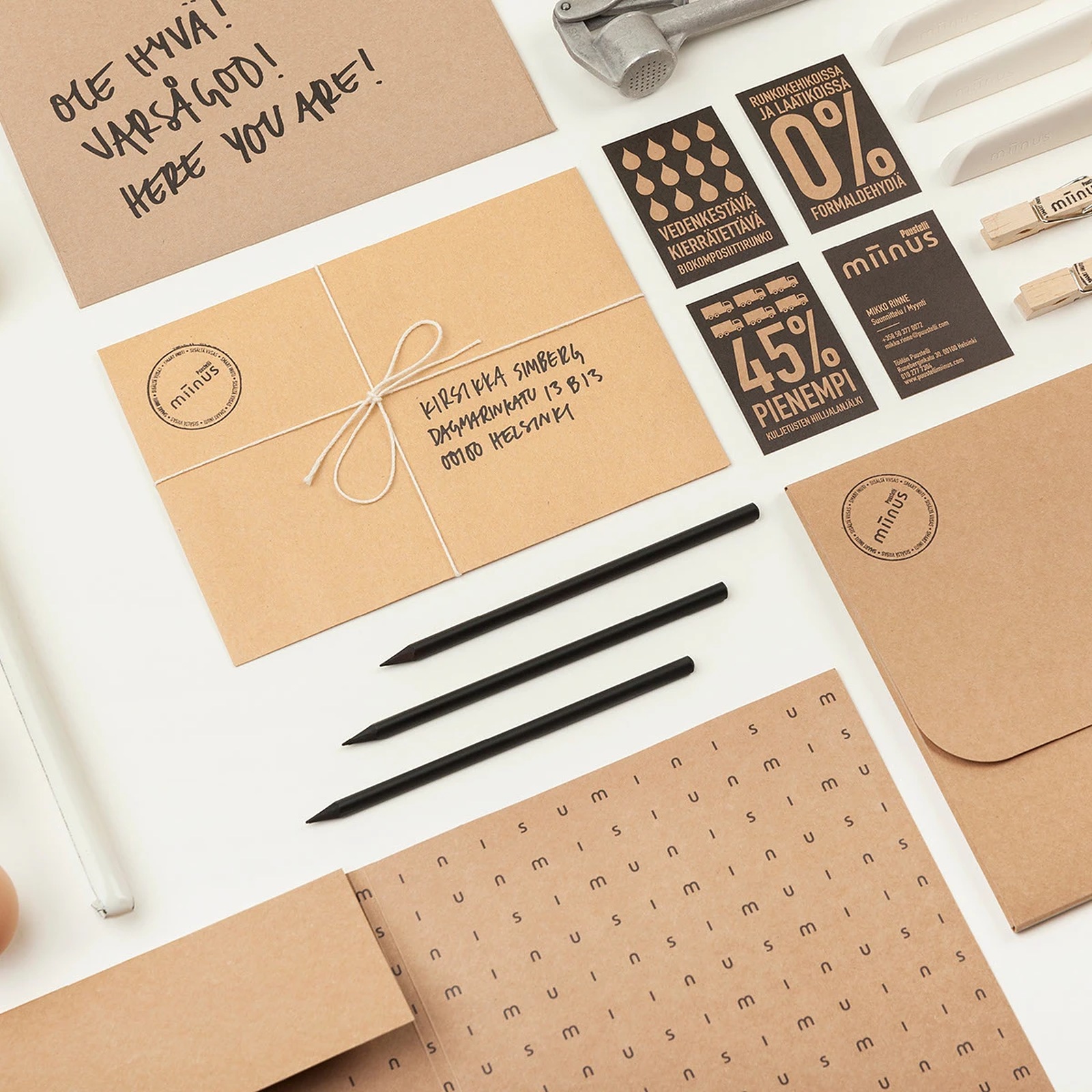
Inside Puustelli Miinus: Brand Identity by BOND
Explore the Puustelli Miinus brand identity by BOND Creative Agency, pairing raw kraft stationery and ecological data grids with Nordic craft. Kitchen catalogues usually drown in glossy showroom clich...
2 weeks ago
8
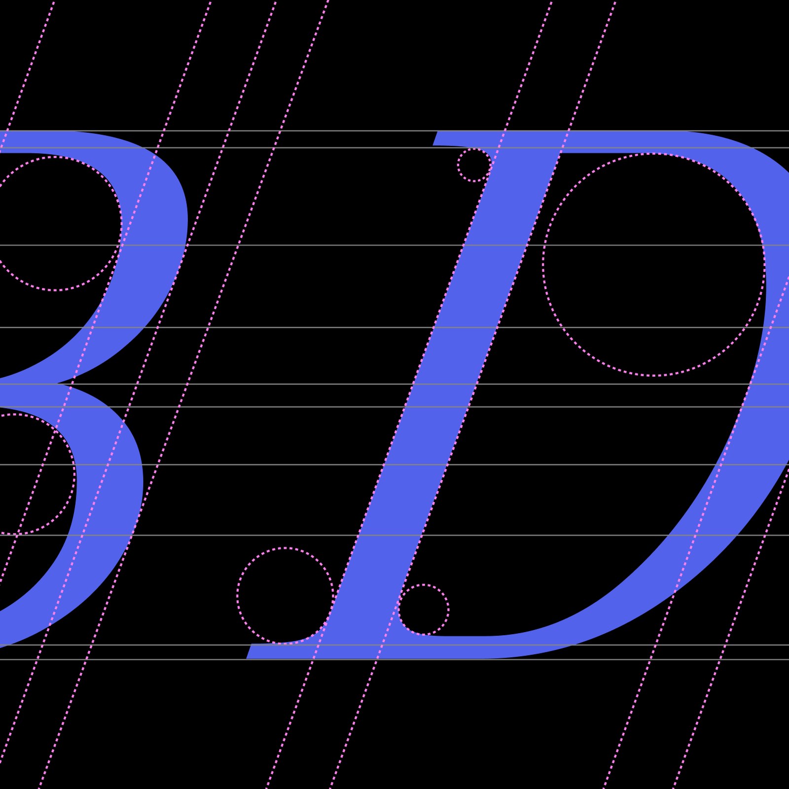
Studiogusto Unveils the Michelangelus Typeface
The Michelangelus typeface decodes Michelangelo's handwriting into a humanist serif, commissioned by the Vatican and shipping with Microsoft 365. The family reads like the Renaissance itself, hand-ink...
2 weeks ago
9
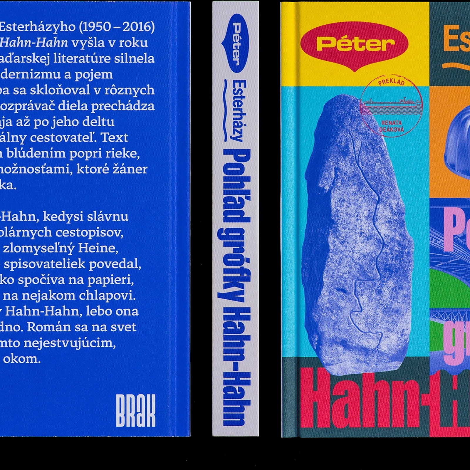
Inside Matúš Hnát’s Book Design for Péter Esterház...
Explore Matúš Hnát's book design for Péter Esterházy's novel The Glance of Countess Hahn-Hahn, published by Slovak literary press BRAK. Postmodern Central European fiction rarely gets a cover that act...
2 weeks ago
9
Popular

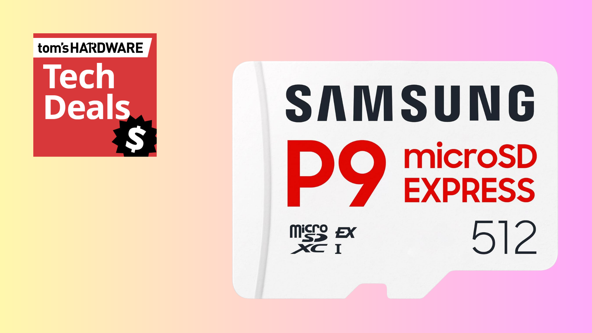
Triple your Nintendo Switch 2's storage for just $99



 English (US) ·