

Graphic Design
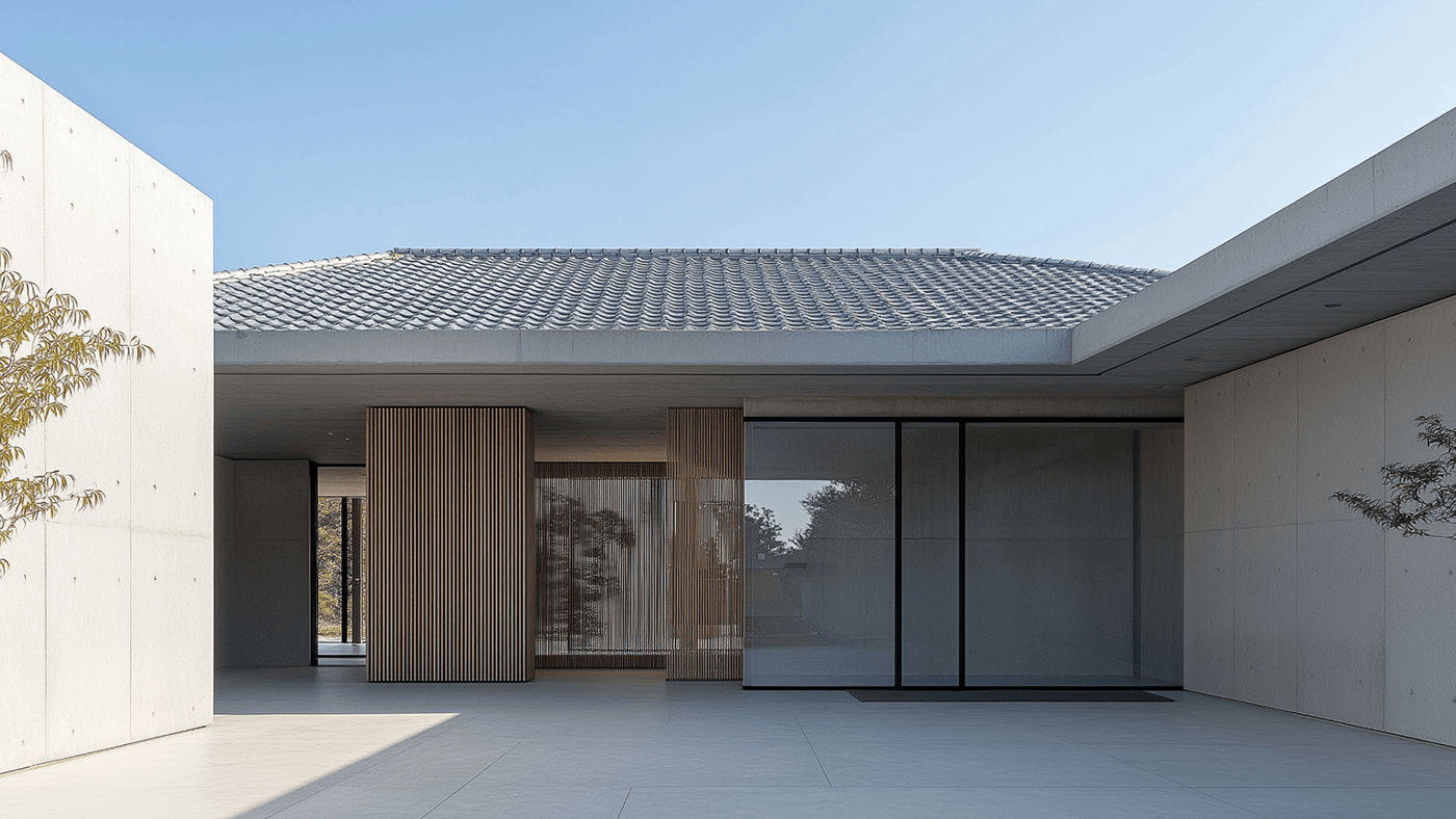
Address 338 Architecture Studio Branding and Visua...
Address 338 is a clean architecture studio branding project by Quang Nguyen featuring crisp grids and tactile paper goods. Designed by Quang Nguyen, Address 338 brings order to studio branding. The de...
 3 days ago
3
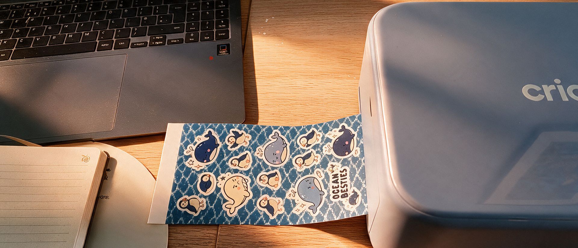
Cricut StickerPix Print + Cut review: a playful, p...
Cricut has made printing stickers and professional photos incredibly easy – now about those refills…
 3 days ago
2
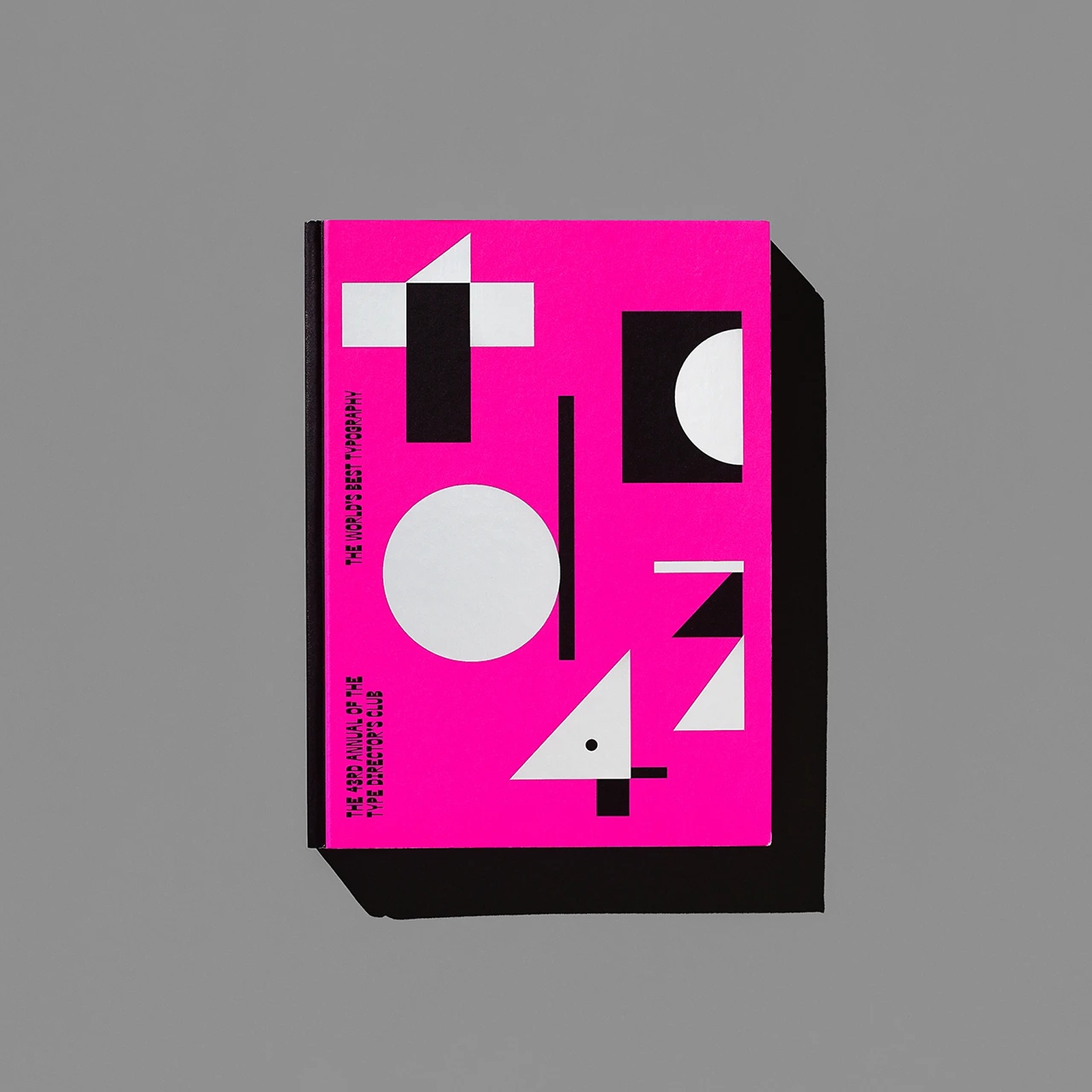
TDC 43rd Annual — Editorial Design by Tereza Betti...
Tereza Bettinardi crafts the editorial design for The 43rd Annual of the Type Directors Club, turning expanded counterforms into a bold book. Designing an awards annual for the Type Directors Club of ...
3 days ago
4
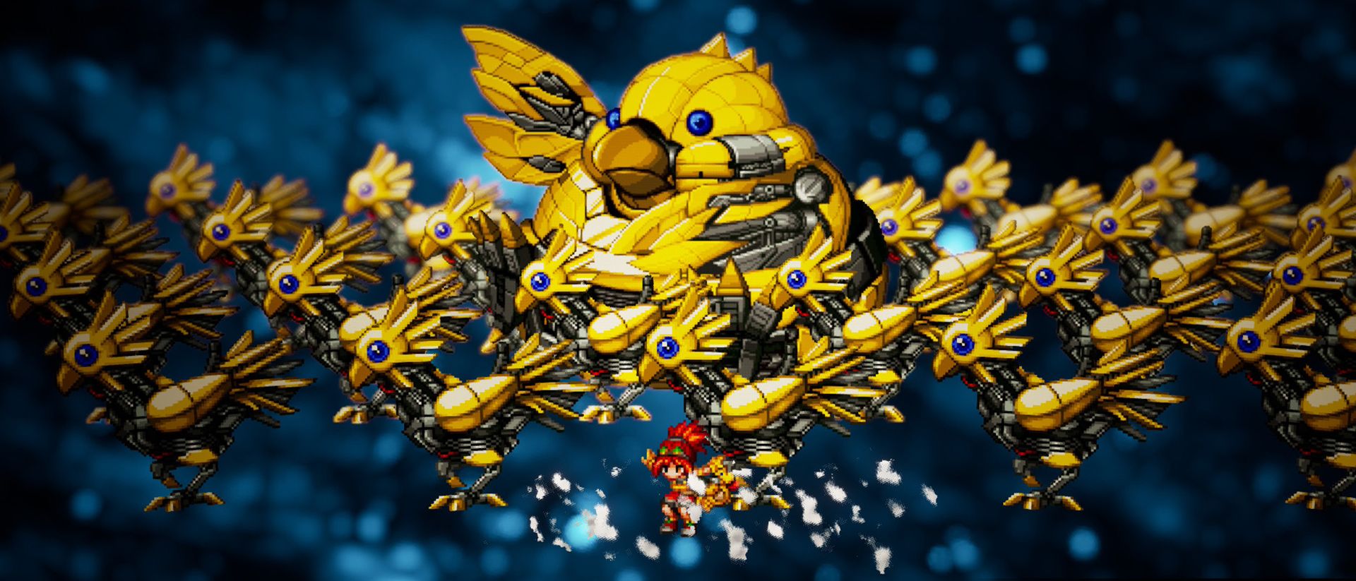
Final Fantasy Resonance (Switch 2) review: modern-...
An overt homage to Final Fantasy I-VI, but more than just a nostalgic exercise.
3 days ago
4
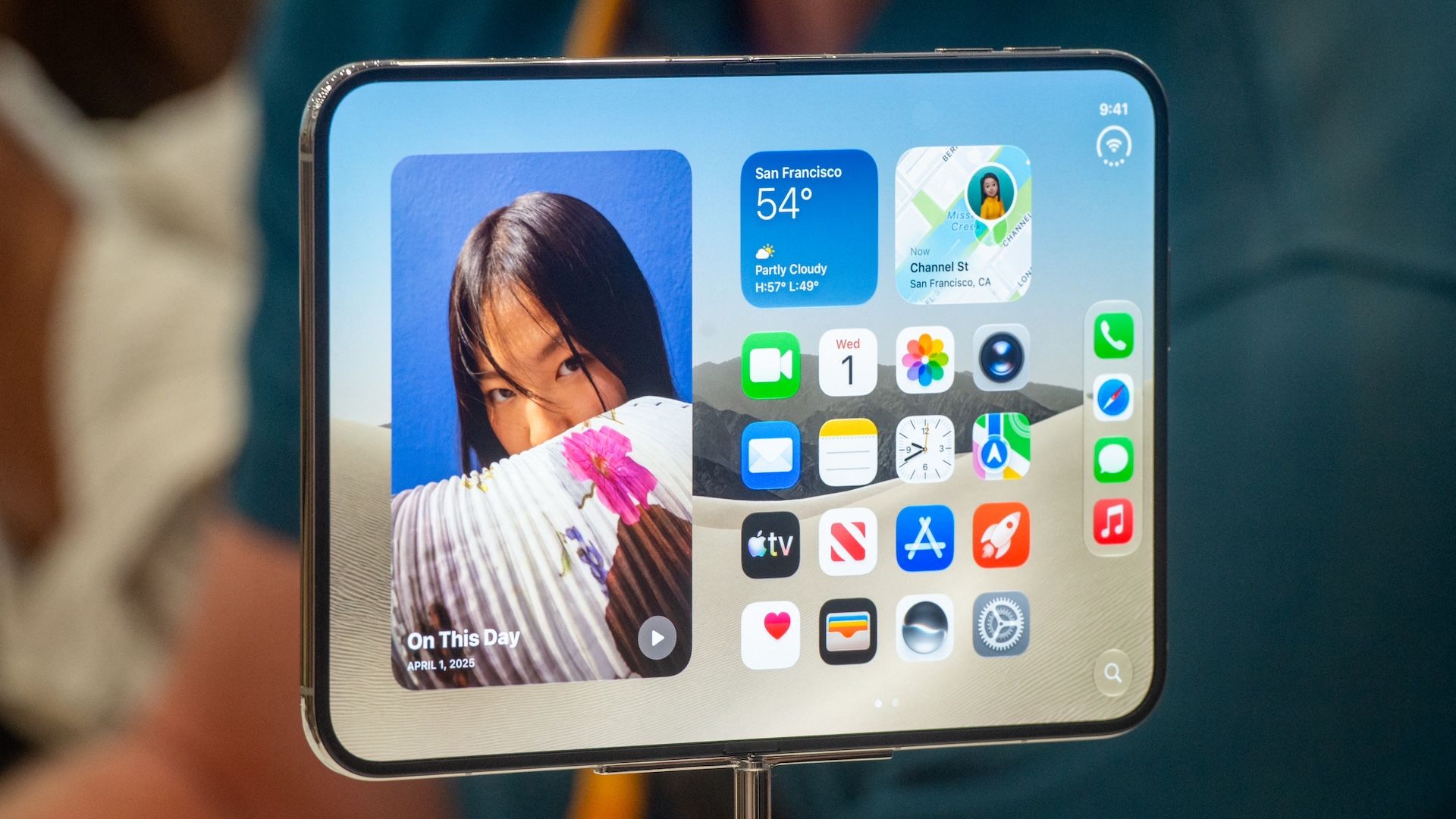
Apple desperately needed a new 'iPhone moment'. Th...
After a string of disappointments, 'extraordinary' demand suggests the new iPhone has captured the public imagination in a brand new way.
3 days ago
5
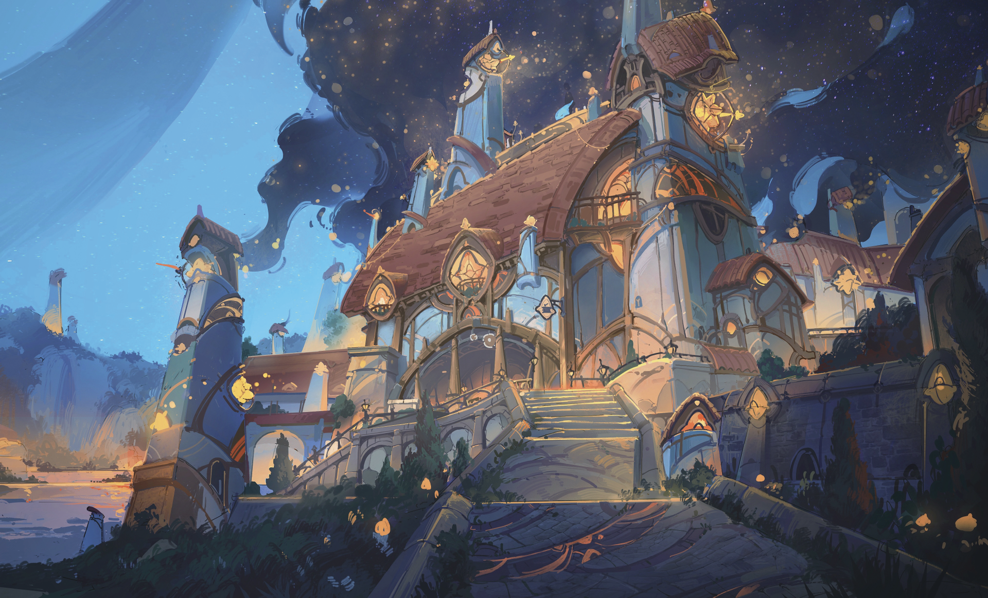
Every part of a fantasy world must follow its own ...
Discover the logical way to building fantasy with artist Oliver Chen.
3 days ago
5
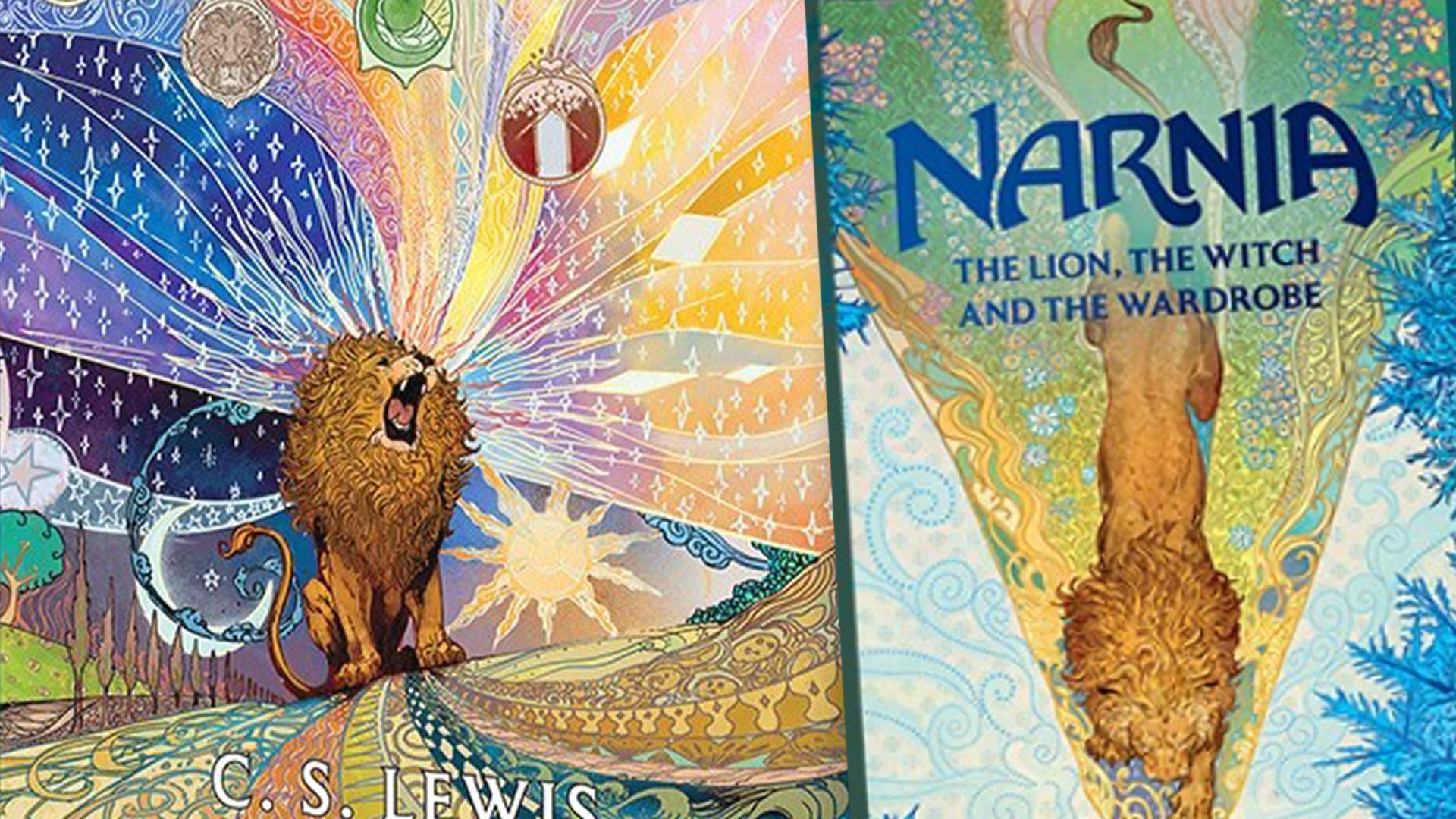
Magical new Narnia cover art is a notch above the ...
Vibrant designs feature illustrations by The Magician's Nephew's concept artist.
4 days ago
3

Google Meet's appearance filters just sent me into...
Will beauty become the new peak of professionalism?
4 days ago
2
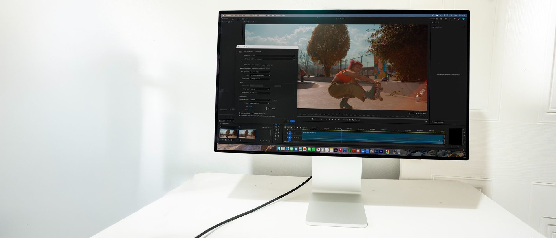
Tested: Apple's $3,000 Studio Display XDR is brigh...
Is Apple's premium monitor worth its price tag for creative workflows?
4 days ago
3
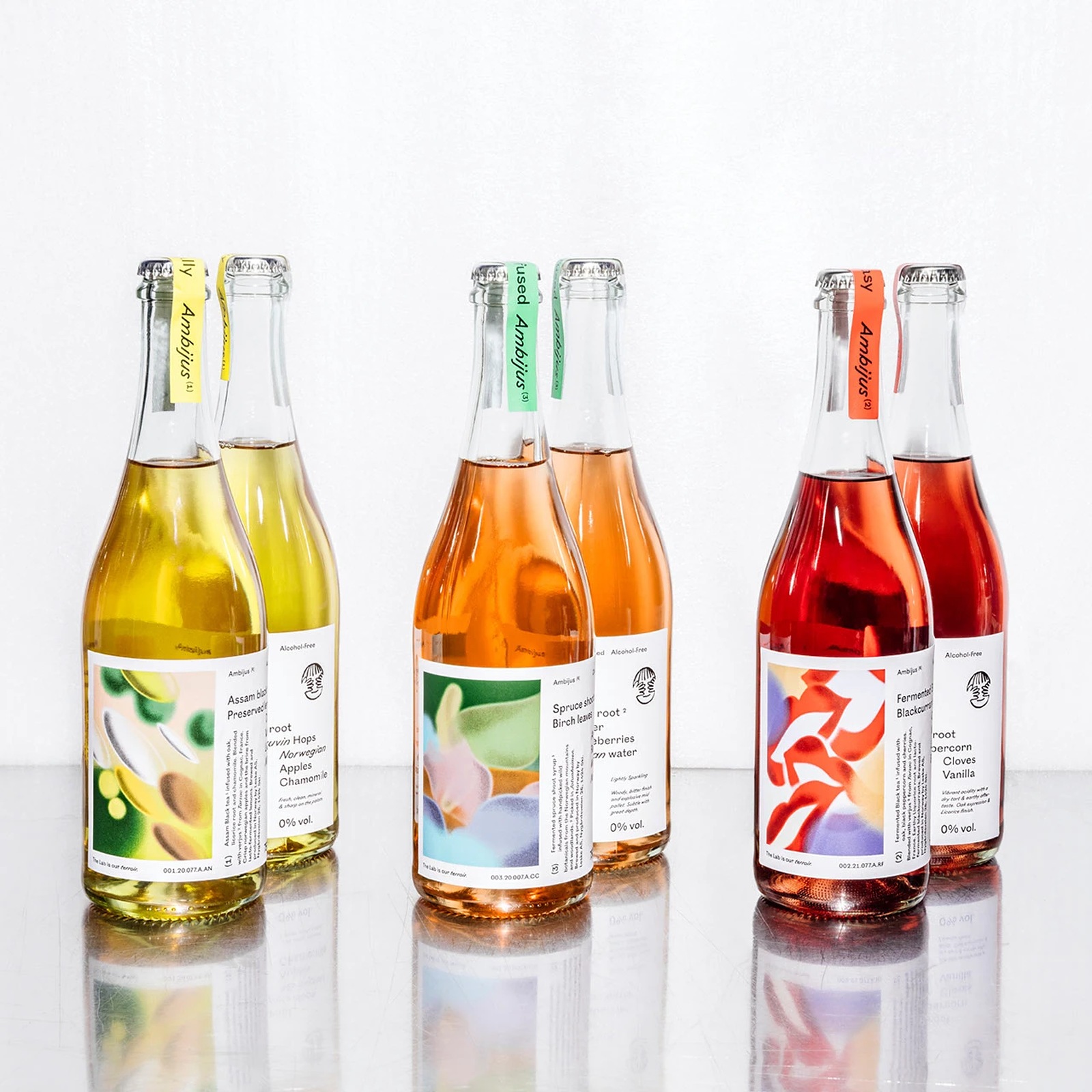
Ambijus: Inside OlssønBarbieri Packaging Design
Oslo studio OlssønBarbieri crafts tactile packaging design for Ambijus, a fermented non-alcoholic wine alternative brewed in Norway by Leske. Most alcohol-free bottles try way too hard to mimic tradit...
4 days ago
4
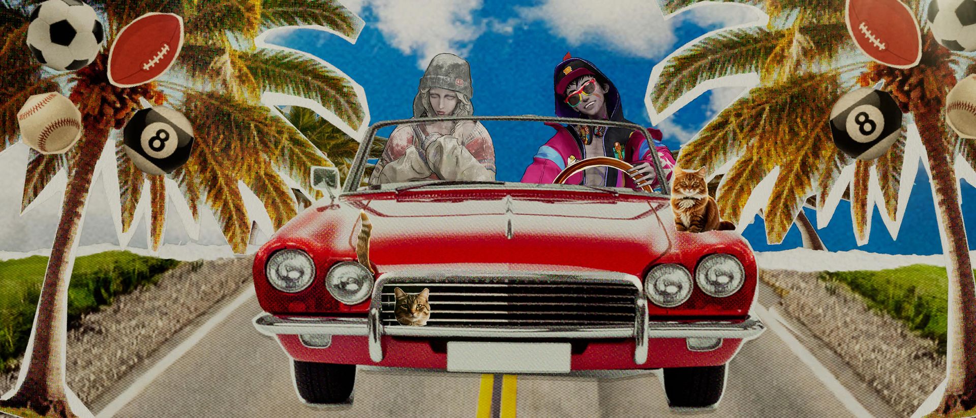
Stupid Never Dies review: the Spider-Verse visual ...
The zombie-punk art riot looks the part, but can become repetitive.
4 days ago
4
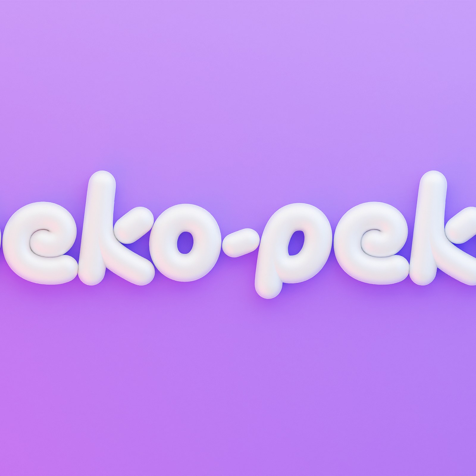
Inside the Craft of Peko-Peko branding by Manifies...
Manifiesto's Peko-Peko branding builds a 3D universe where kawaii meets Mexican cariño, anchored by a balloon-letter logo. Mexico City studio Manifiesto calls the project "Mexicute is a mood," and the...
4 days ago
5

Typography: Server Mono by Blaze Type for INTDEV
Blaze Type and INTDEV team up on Server Mono, an open-source monospaced font built for terminal legibility and crisp web typography. Developers stare at terminal windows all day. If a zero looks too m...
4 days ago
3
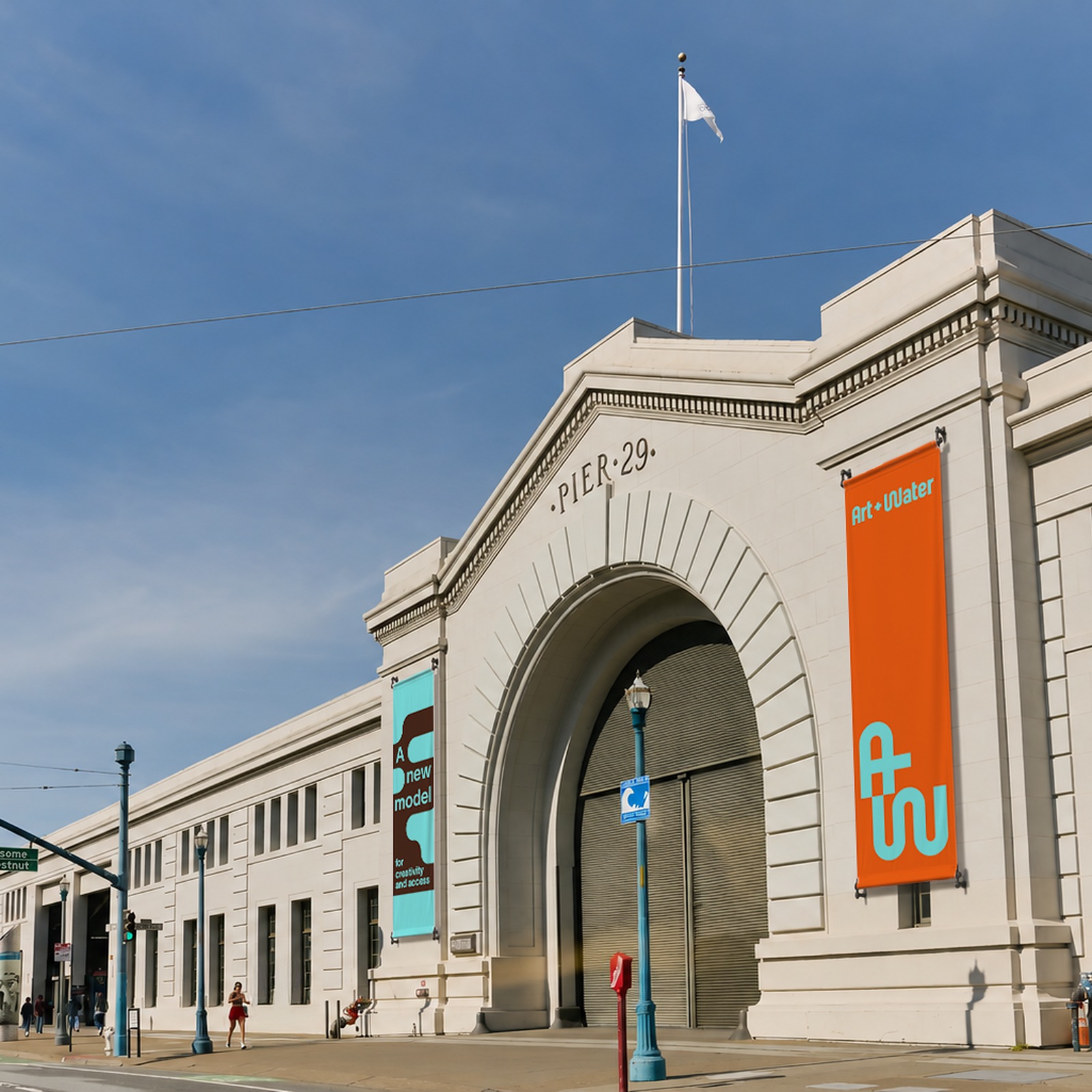
Art + Water: A Fluid Brand Identity by MacFadden &...
MacFadden & Thorpe and Anisha Sachar craft a fluid brand identity for Art + Water, an alternative art hub at San Francisco's Pier 29. Art school tuition has reached absurd heights. Watching emergi...
4 days ago
5

Logistics fiasco or clever marketing? Apple's iPho...
Hype for the $1,999 foldable is now through the roof – but you might still be able to get one before January 2027.
4 days ago
4
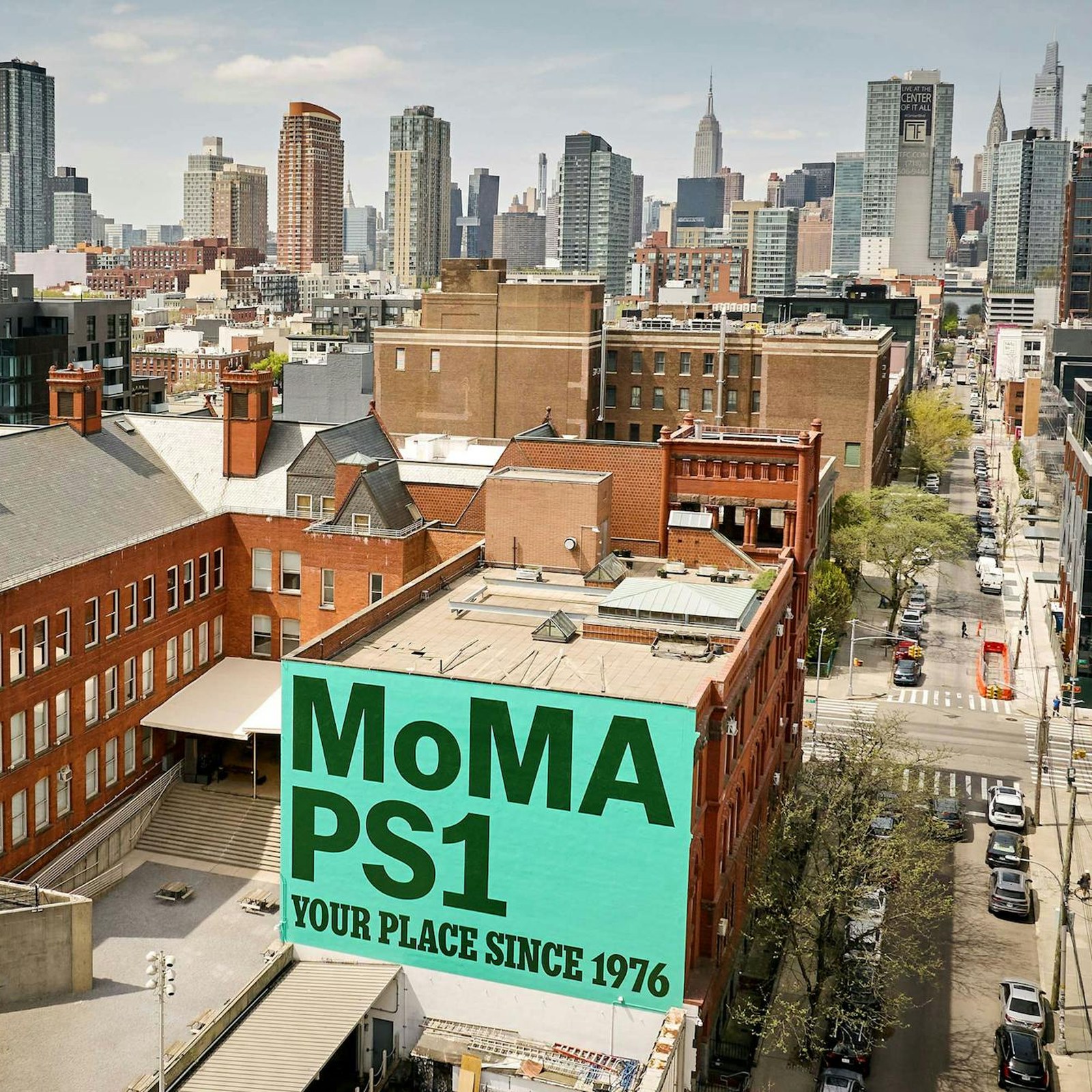
PS1 Is Your Place: A Masterclass in Brand Design b...
Porto Rocha’s PS1 Is Your Place turns MoMA PS1’s 50th anniversary into a living declaration: your place to explore, gather, dance, and discover. The idea works because it treats identity as invitation...
4 days ago
3
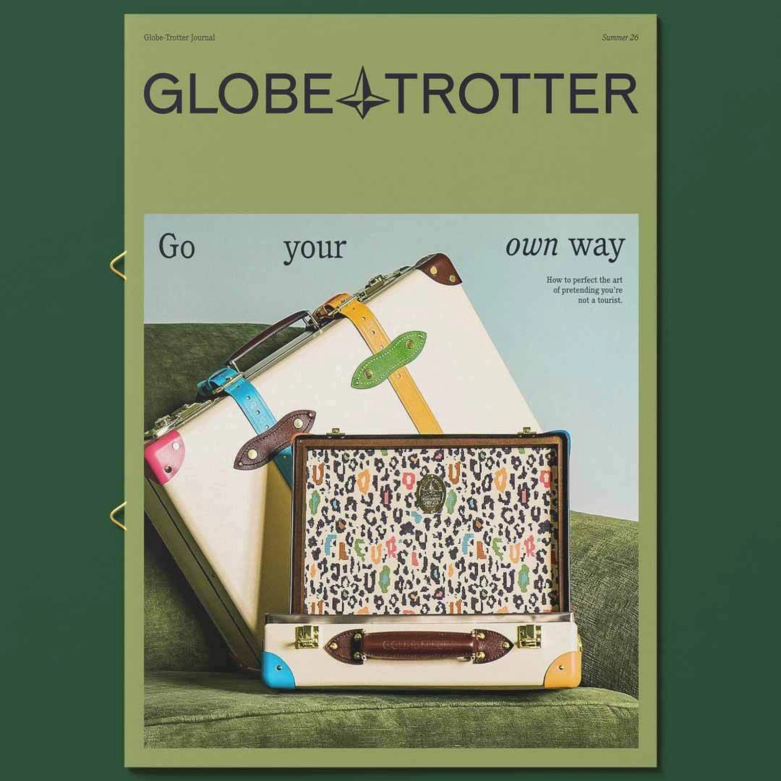
Brand Identity: Globe-Trotter by Ragged Edge
Ragged Edge crafts a character-led brand identity for British luggage maker Globe-Trotter, reviving its 1897 North Star crest and typography. Luxury branding has a sameness problem. Over the last deca...
4 days ago
5
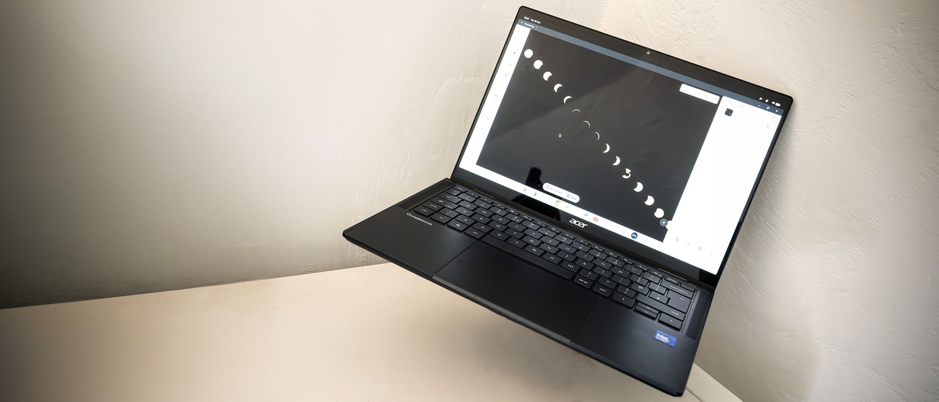
Tested: The Googlebook tries to put Android on the...
Acer Googlebook review: a new, Chrome-plated, Android
4 days ago
4
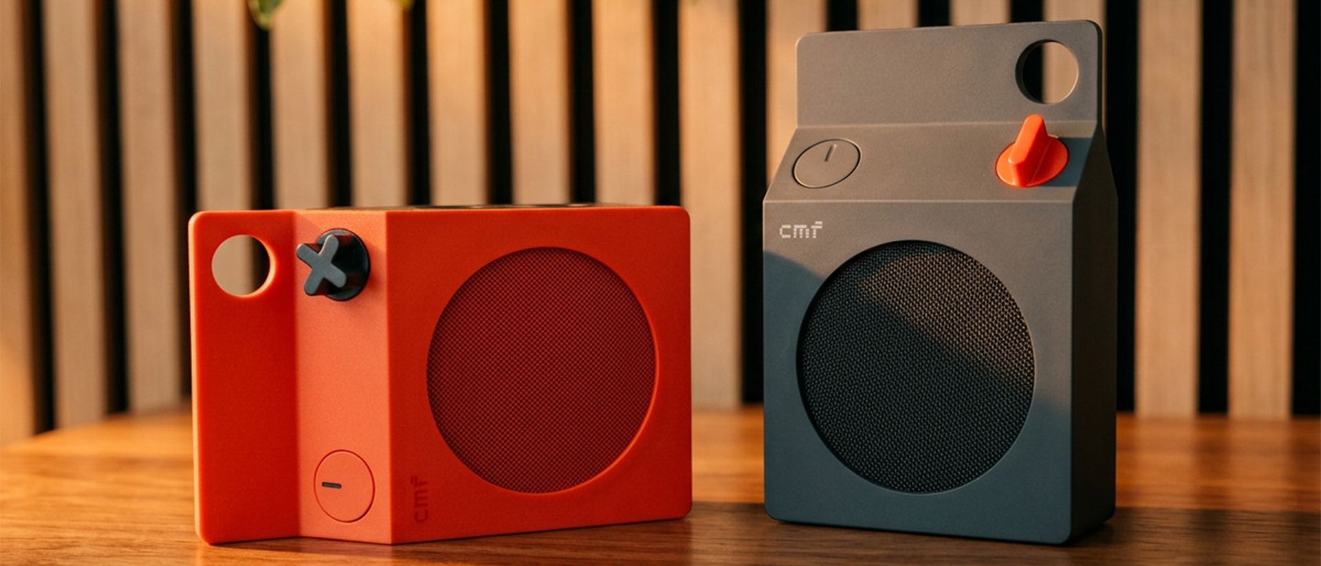
CMF Speaker S review: this little milk carton soun...
A big, wraparound sound in a small box, but you'll need more than one.
4 days ago
11
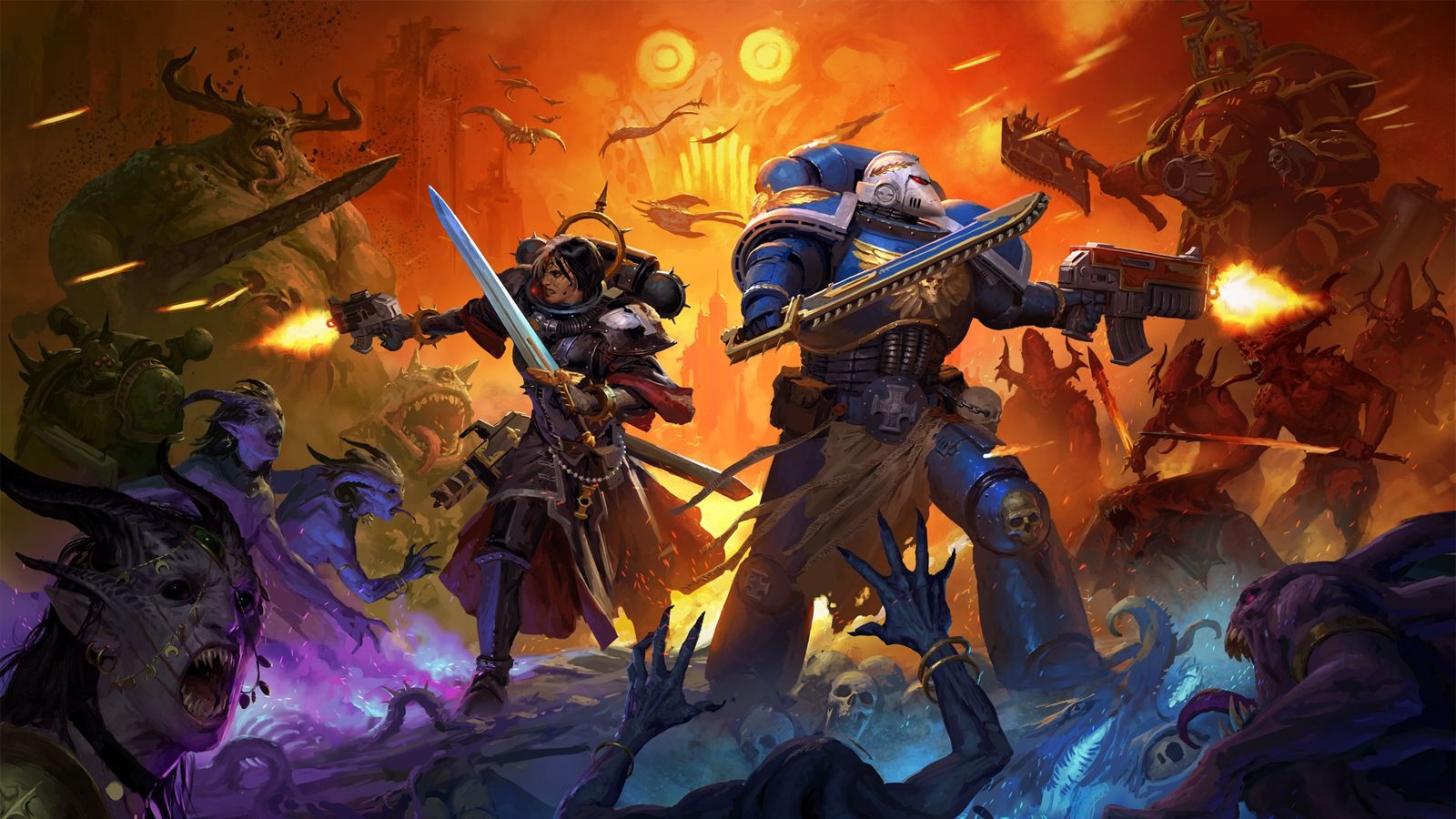
Warhammer 40,000: Boltgun 2's lead artist reveals ...
Mark Chambers explains why the crisp retro pixels are not what they seem.
5 days ago
5
Popular




 English (US) ·