

Graphic Design
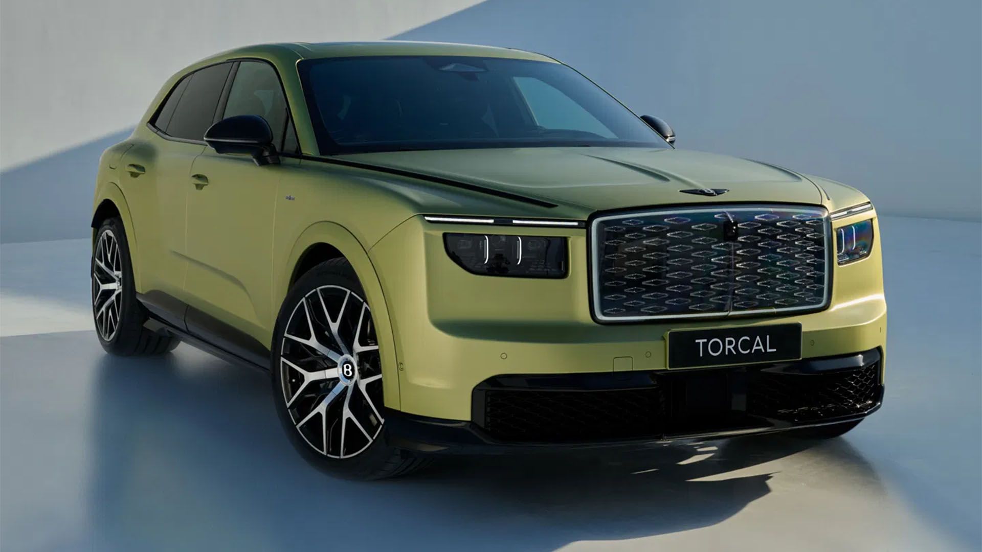
Electric cars are killing the joy of driving, but ...
DLMDD’s Max De Lucia discusses the importance of sound in EV design.
 1 week ago
7
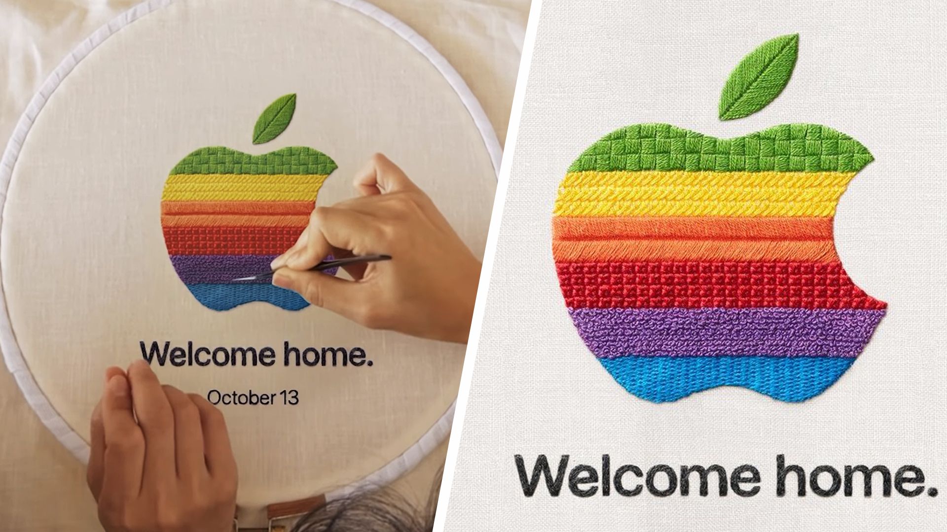
Its embroidered logo invite shows Apple understand...
Apple seems to have learned from past advertising blunders.
1 week ago
7
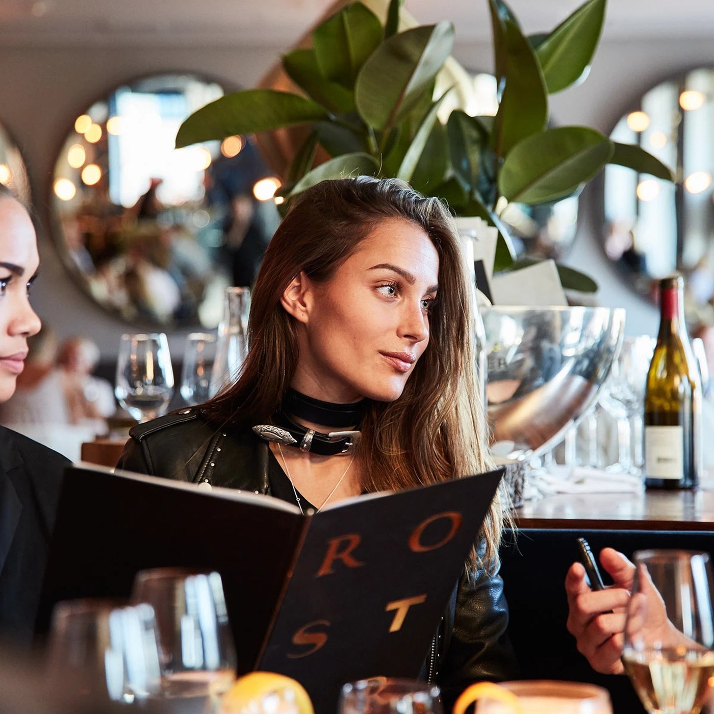
Inside the Craft of Roster: Branding Design by BON...
BOND designed a complete branding design system for Helsinki restaurant Roster, pairing custom typography with playful tattoo illustrations. Chefs Kari Aihinen and Paul Hickman wanted to strip away th...
 1 week ago
15
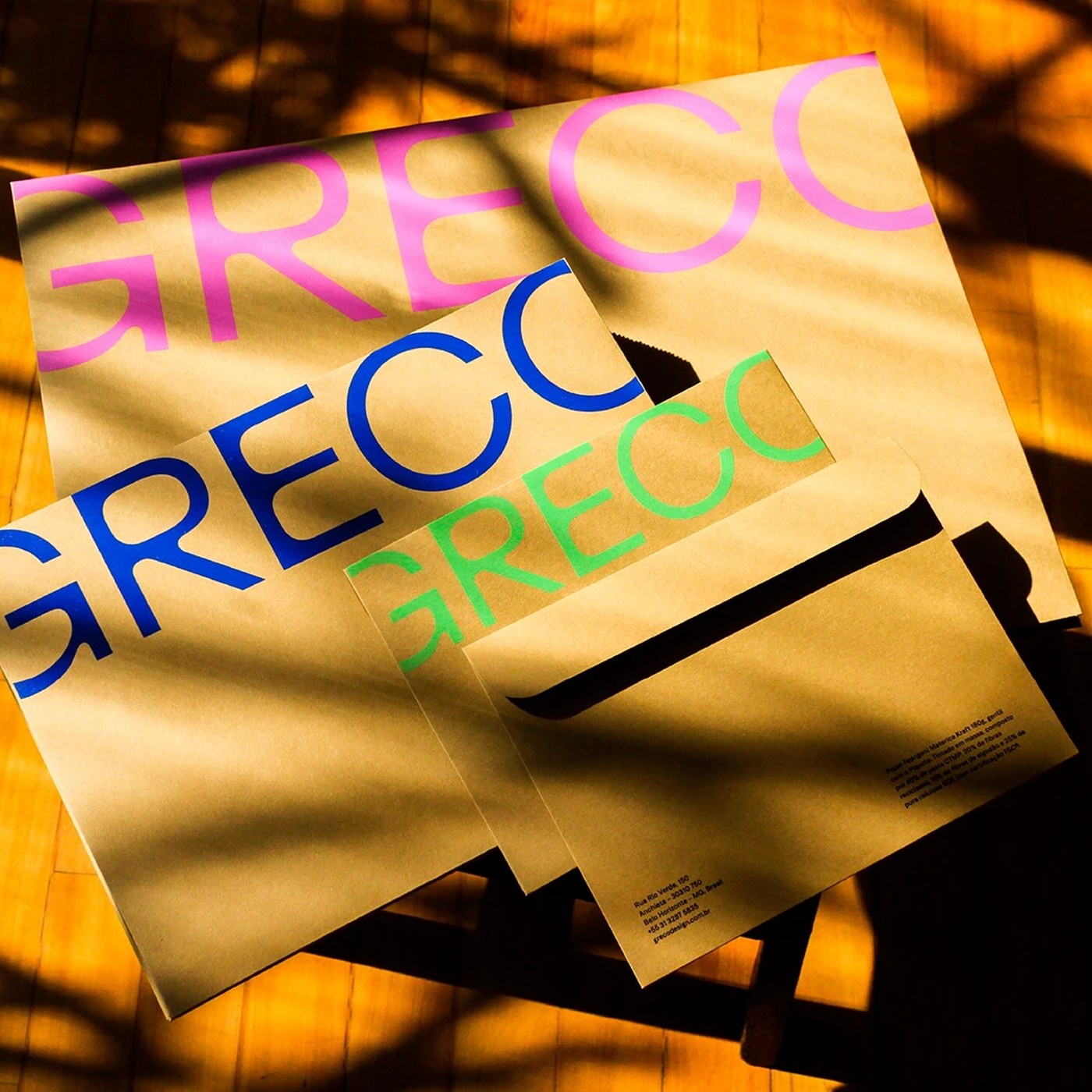
How Plau Design Reimagined Type Design for Grecoti...
Plau Design teamed with studio Greco to build Grecotipo, a bold 32-font family bridging tactile craft with modern type design. Brazilian design studio Greco needed a clear voice for physical spaces an...
1 week ago
6

Bureau Brandt Unveils the Brandt Gallery Rebrand
Brandt Gallery turns ten with a Bureau Brandt rebrand: a custom geometric wordmark, ABC Laica type, and monochrome with a punchy blue accent. The centerpiece is the new wordmark, set all lowercase and...
1 week ago
6
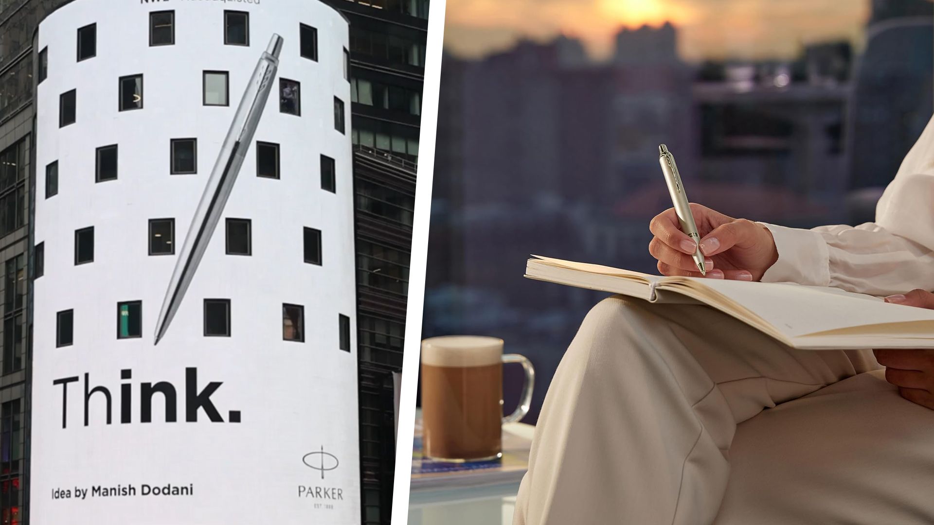
The pen that went viral with those anti-AI ads has...
Rediscover the focus and creativity that comes with handwriting with the iconic pen used by James Bond.
1 week ago
7
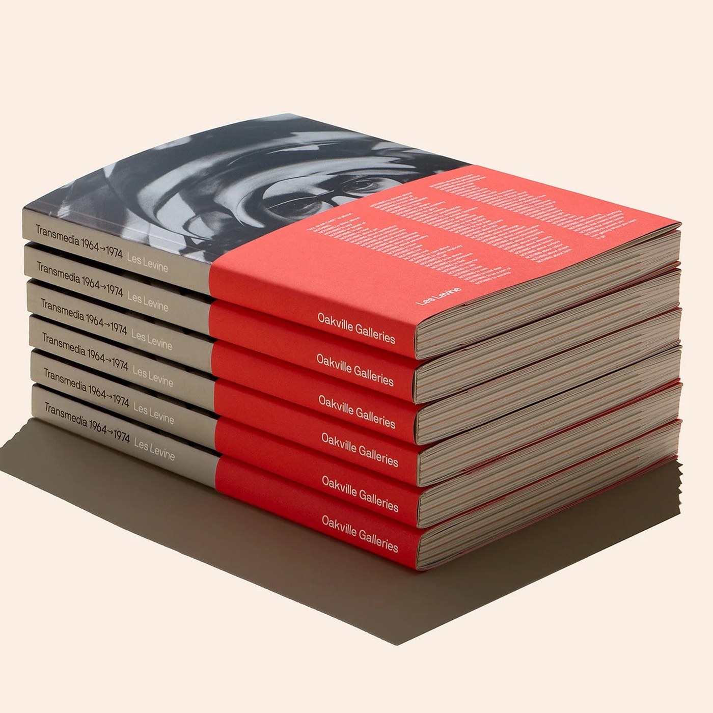
Les Levine — Masterclass in Editorial Design by Un...
Underline Studio crafts tactile editorial design for Les Levine: Transmedia 1964–1974 at Oakville Galleries with silver ink and plastic paper. Les Levine is widely recognized as a founder of media art...
1 week ago
6
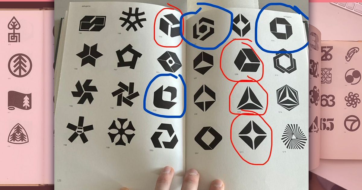
Did a book from 1973 predict the logo designs of s...
From AMD to Google, it seems there's nothing new under the sun.
2 weeks ago
6
Why ‘boring’ AI is Hollywood’s best bet
The technology could be the industry's secret weapon – just not how you'd expect.
2 weeks ago
8
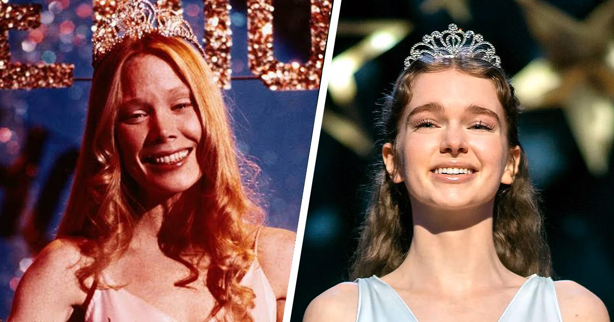
The Carrie remake is getting roasted over its chan...
Does Amazon's Carrie expand the story or write a completely new one?
2 weeks ago
7
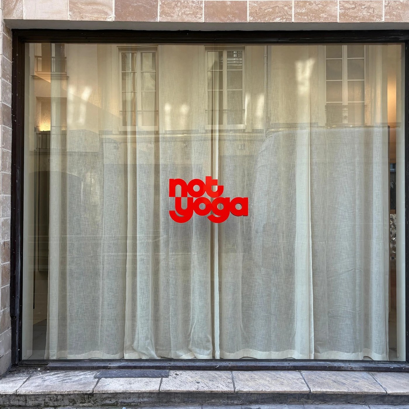
Not Yoga: Brand Brothers Explores Visual Identity
Brand Brothers designed a hypnotic visual identity for Paris studio Not Yoga, pairing a kinetic monogram with undulating graphic waves. Located at 13 rue des Tournelles in Paris, Not Yoga strips away ...
2 weeks ago
16
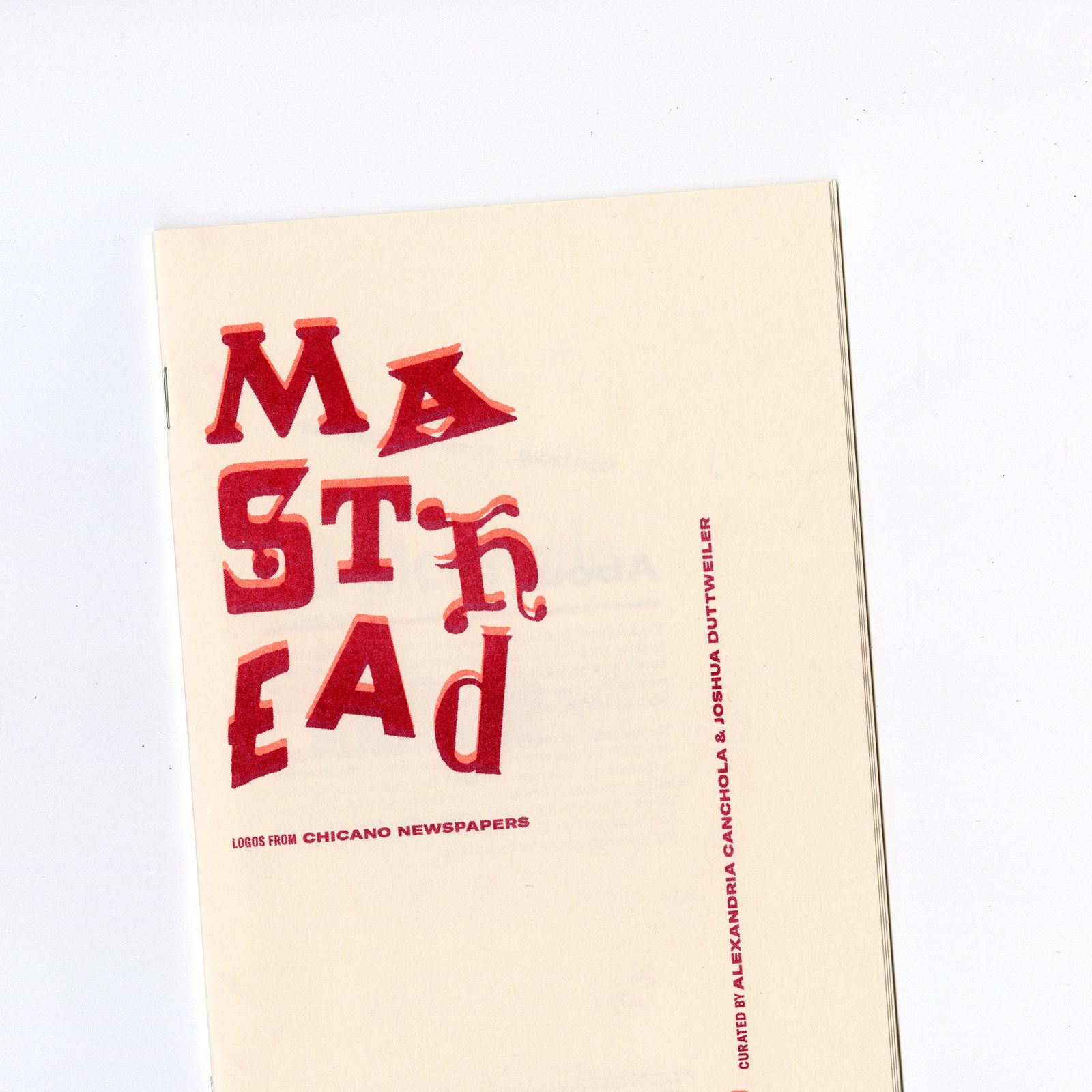
Masthead Zine Is a Masterclass in Typography by Du...
Masthead Zine reprints logos from 1960s and 70s Chicano newspapers as a red-ink zine by Alexandria Canchola and Joshua Duttweiler. The first thing you notice is restraint. One vermilion red on warm cr...
2 weeks ago
5
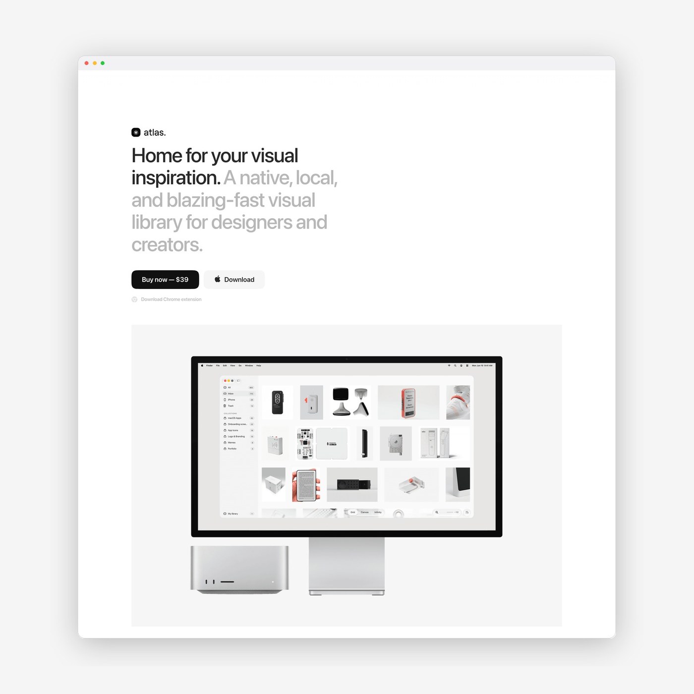
Web Design: Atlas for Mac by Alexey Sekachov
Alexey Sekachov designed the web design for Atlas for Mac, combining stark typographic hierarchy with minimal, native product storytelling. Digital software marketing often falls into the trap of visu...
2 weeks ago
5
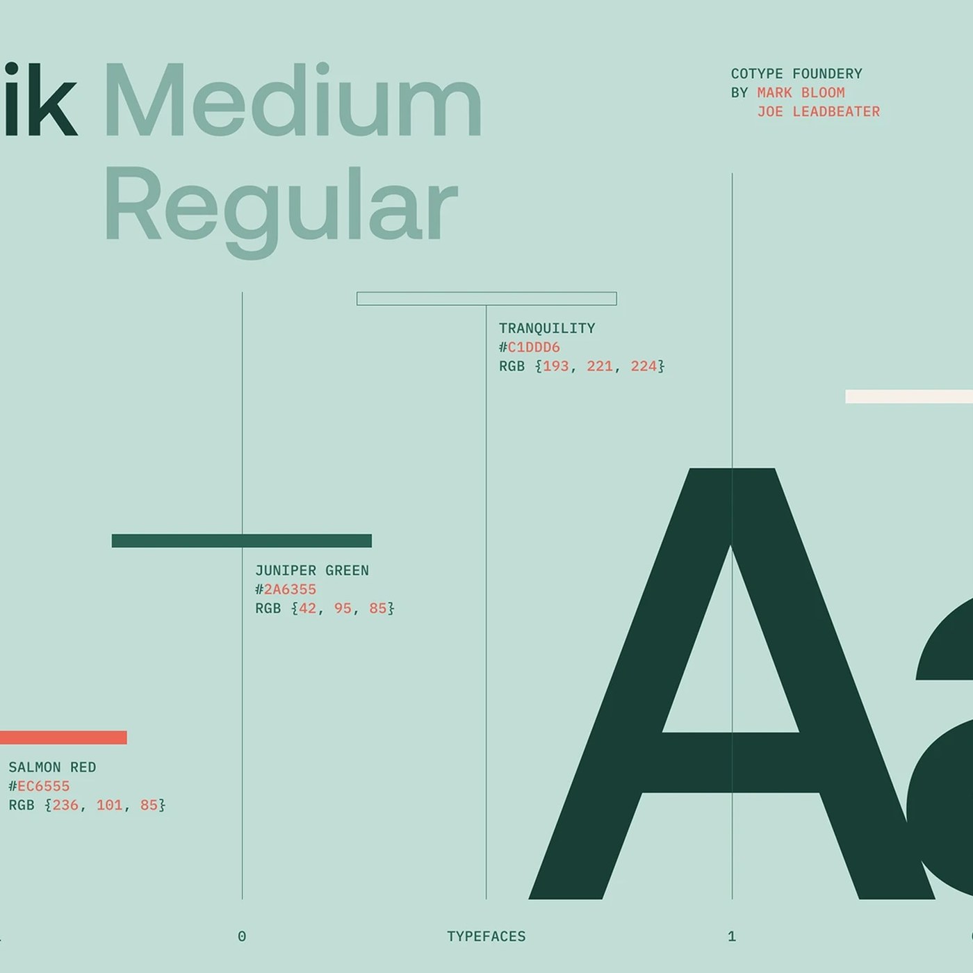
tubik studio Unveils Crezco UI/UX Design
tubik studio crafts an accessible ui/ux design system for Crezco, pairing Aeonik typography with clear API architecture and responsive grids. Design studio tubik first paired with Crezco in 2019 to sh...
2 weeks ago
5
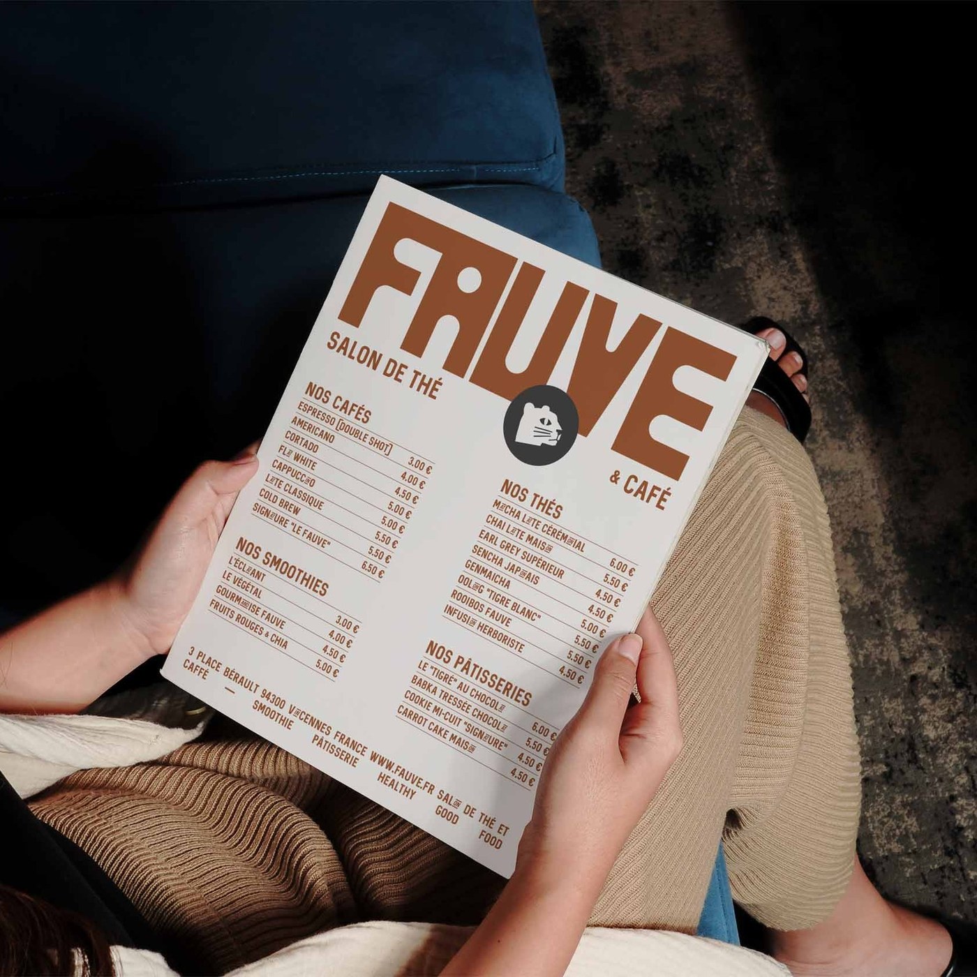
FAUVE: Palantis Crafts an Architectural Brand Iden...
Palantis designs a sharp, modular brand identity with earthy palette for FAUVE, a contemporary tea room and specialty coffee shop in Vincennes. If you have spent any time roaming third-wave cafes over...
2 weeks ago
5

Intuit Rebrand: Inside JKR's New Identity System
JKR built the Intuit rebrand around one idea: the letter i. A new lowercase wordmark detaches into an animated symbol for Intuit Intelligence. The whole system reads like it wants to start a conversat...
2 weeks ago
5
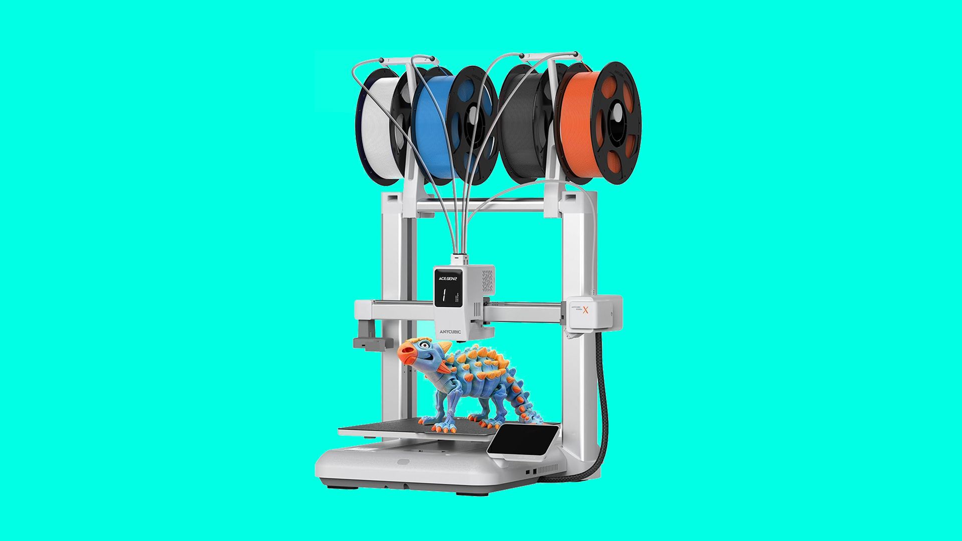
Wait, the best multicolour 3D printer for beginner...
The Anycubic Kobra X has $160 off an is now just $299.99.
2 weeks ago
6
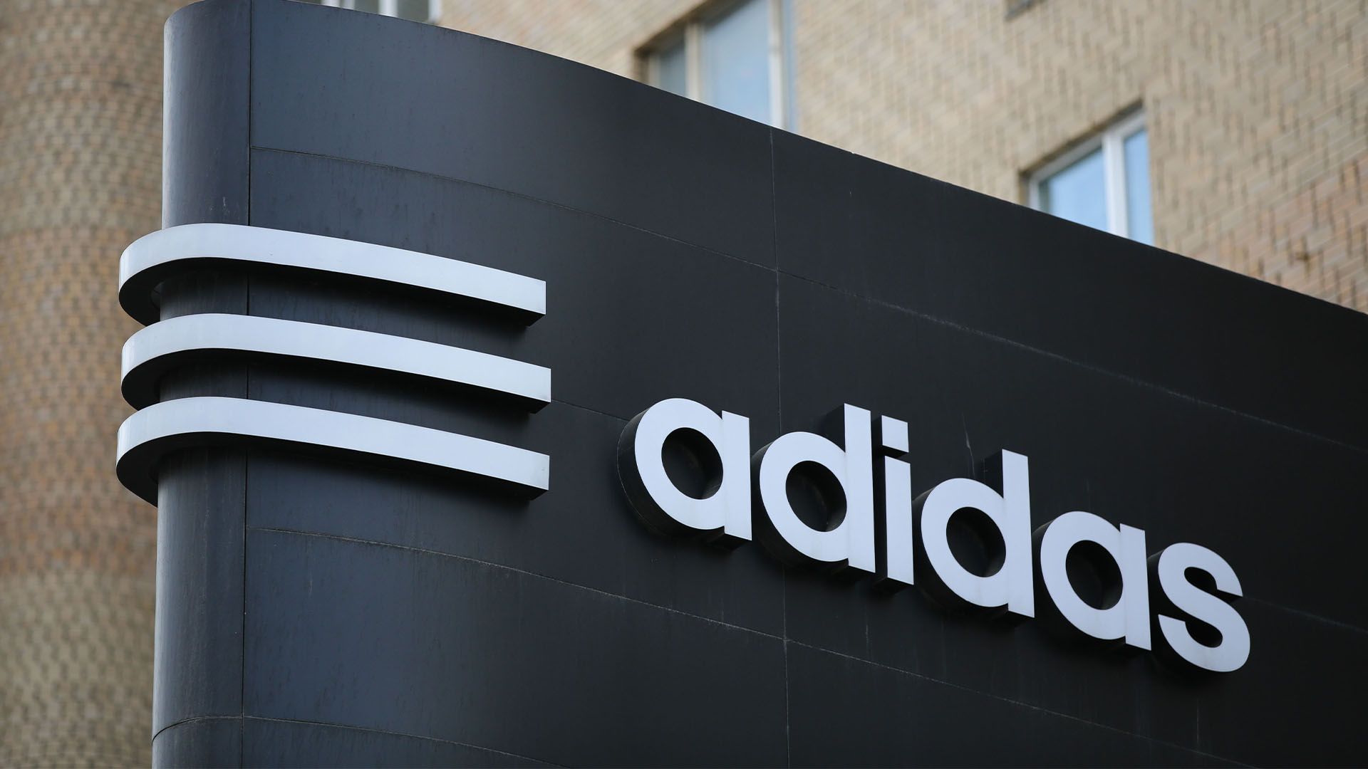
Adidas sues White Fox in battle of the stripes
It claims the Australian brand’s clothing is “substantially identical”.
2 weeks ago
6
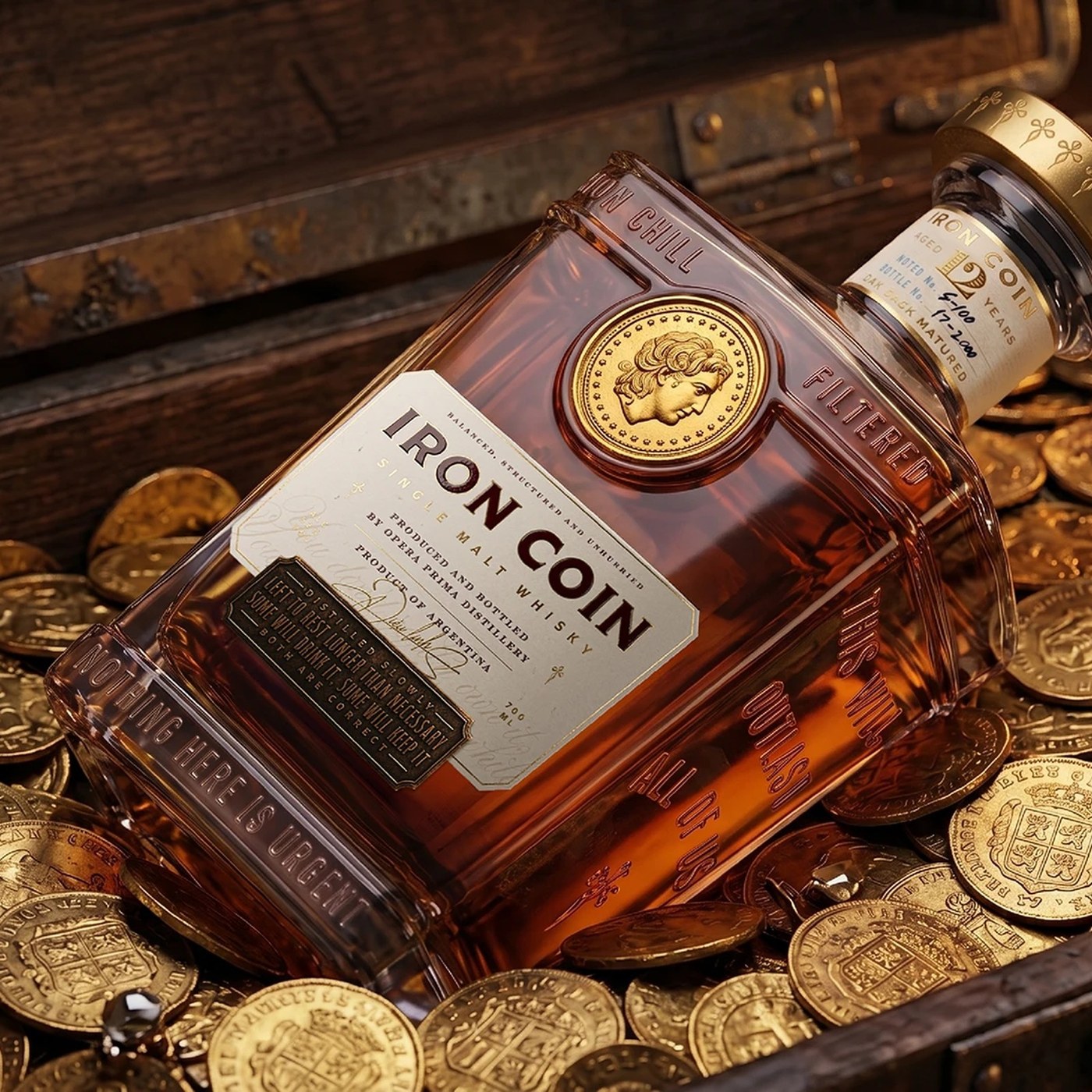
Packaging Design: Iron Coin Whisky by Opera Prima
Opera Prima crafted a tactile packaging design for Iron Coin Whisky, pairing heavy faceted flint glass with minted metallic coin talismans. Most luxury spirits rely on decorative filigree or loud neck...
2 weeks ago
6
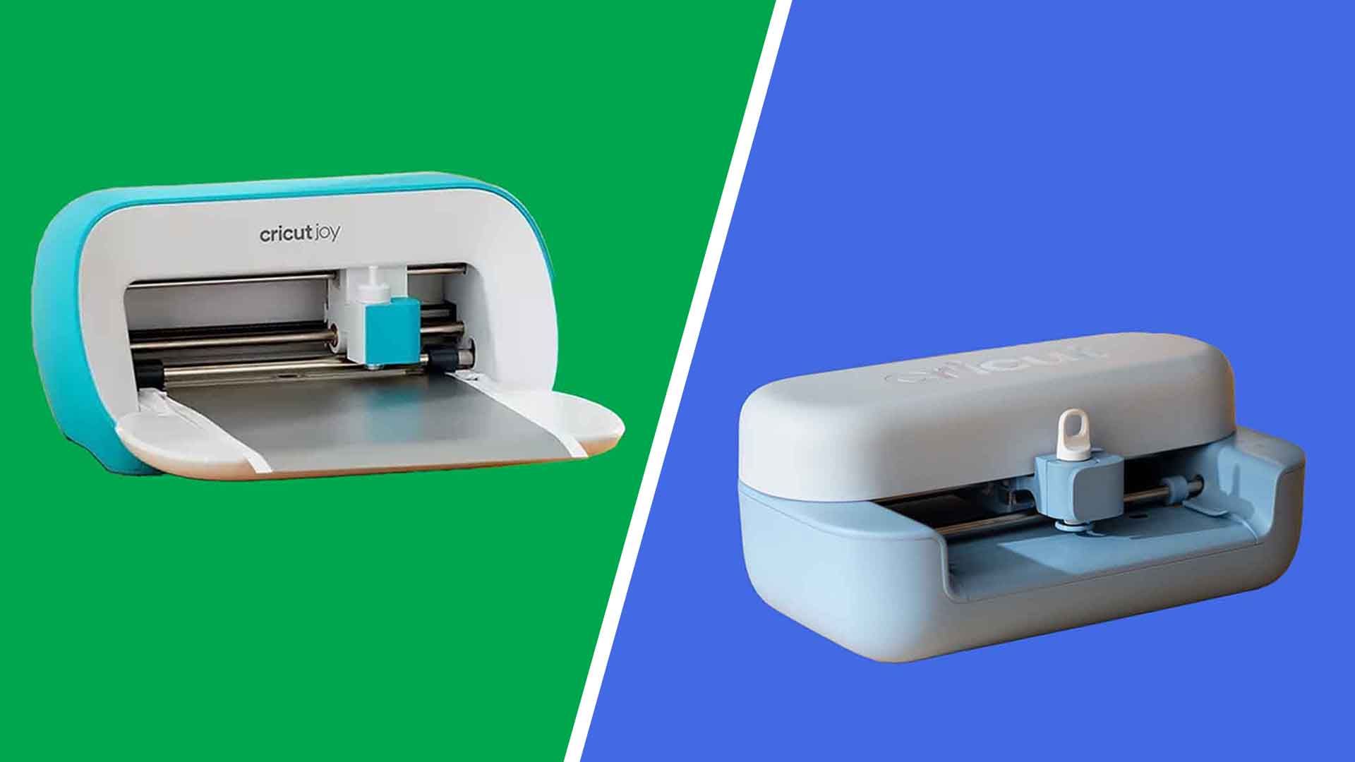
Cricut Joy 2 vs Cricut Joy: which compact cutting ...
Cricut's smallest machine has been redesigned, so we compare the Joy 2 with the original Joy to see which one deserves a spot on your desk.
2 weeks ago
7
Popular





 English (US) ·