
Web Design

WordCamp US 2026: 7 Reasons to Connect with Your W...
WordCamp US 2026 heads to Phoenix this August, and WordPress.com will be there. Here are seven reasons to join the WordPress community in person.
 3 days ago
2
3 days ago
2

Master SEO & AIO: Get Your Site Found in Search an...
Search now includes AI answers, not just Google. Our free, beginner-friendly Master SEO & AIO course shows you how to get found either way.
3 days ago
1
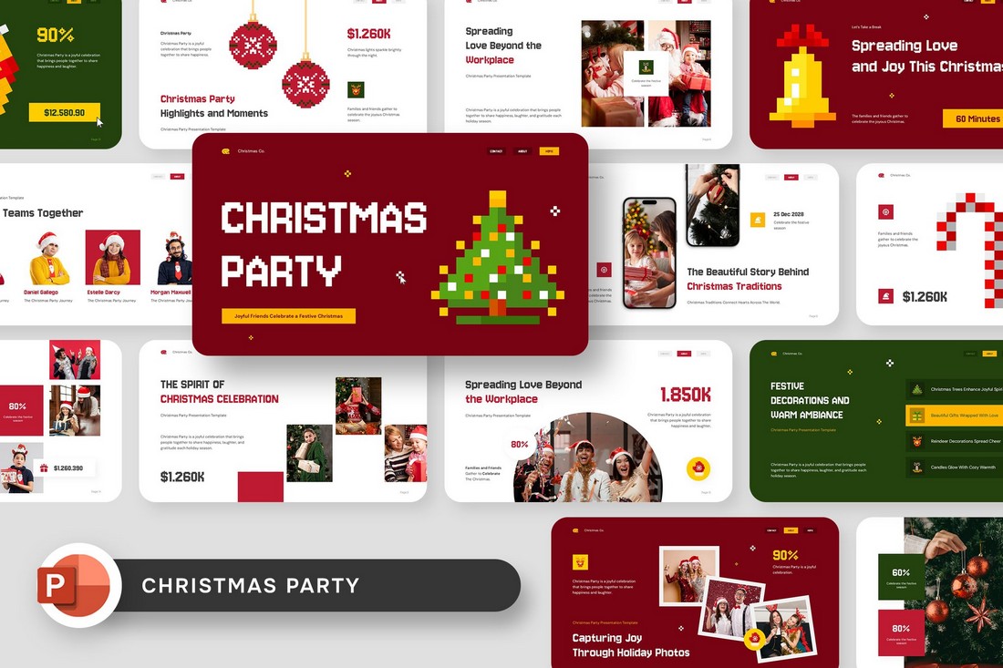
20+ Festive Christmas-Themed PowerPoint Presentati...
Christmas-themed PowerPoint templates are a simple way to turn any presentation into a festive and visually engaging experience. These templates are designed with seasonal elements like snowflakes, ornaments, holiday lights, and warm winter color palettes. They instantly set the...
 3 days ago
1
3 days ago
1
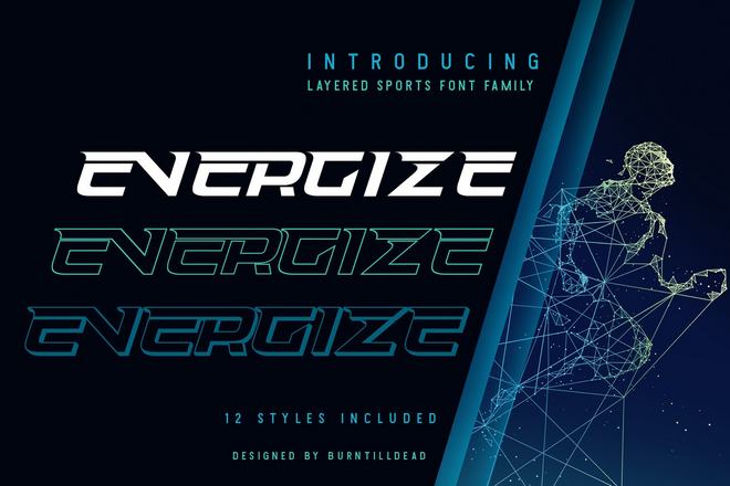
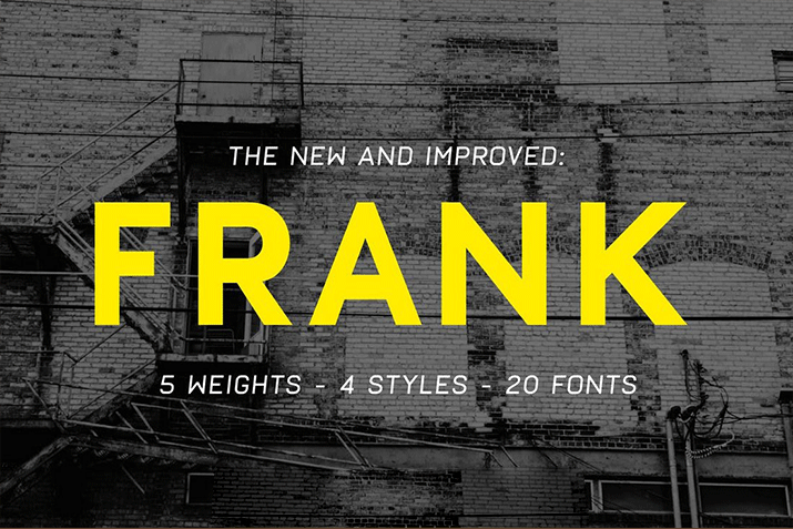
20+ Handpicked Energy Fonts for Dynamic Title Desi...
Energy fonts bring a bold and electric personality to modern typography. With aggressive shapes, fast-moving letterforms, and high-contrast details, these fonts are crafted to create a sense of action and momentum. They instantly add intensity to headlines and make...
3 days ago
2
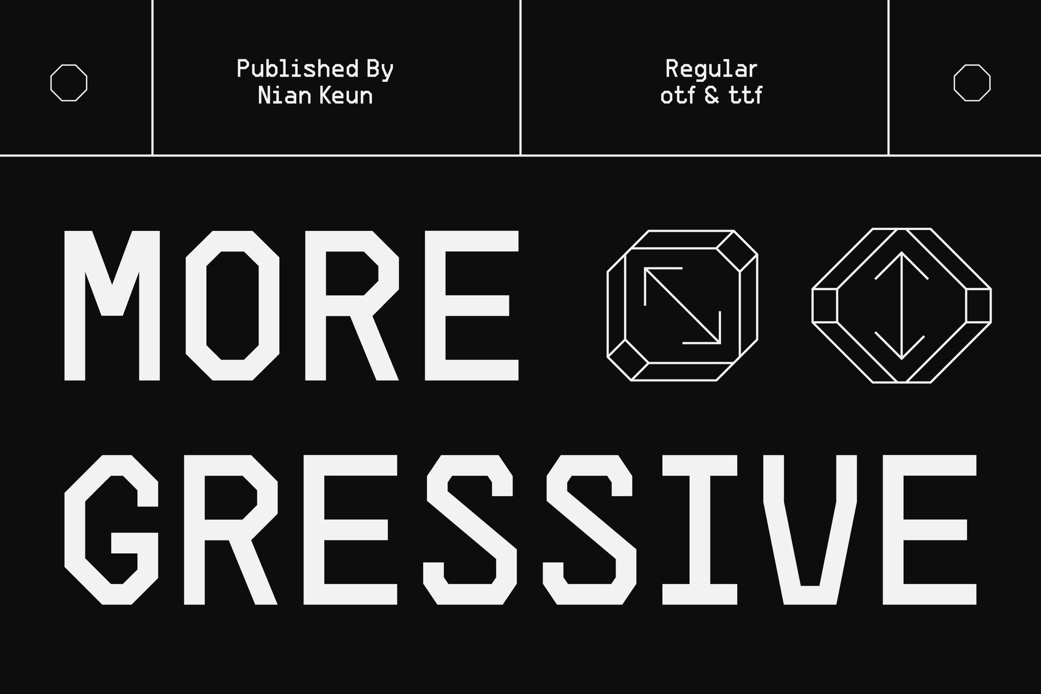
20+ Professional Fonts for Design Systems & Compon...
A well-chosen font can elevate a design system from functional to thoughtful. In this set of fonts for design systems, you’ll discover typefaces that balance adaptability with aesthetic strength. The fonts in this collection strengthen tone, hierarchy, and rhythm...
3 days ago
2
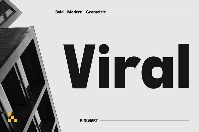
20+ Exceptional Brutalist Fonts for Bold Design Pr...
What makes brutalist fonts so versatile is their ability to communicate both rebellion and restraint. With the right brutalist font, your project will feel fearless, architectural, and undeniably bold, capturing the perfect balance between raw creativity and refined control....
3 days ago
1

Weaponizing And Defending The React Flight Protoco...
While React Server Components rely on the custom Flight protocol to stream interactive UIs, this same mechanism introduces powerful deserialization sinks that attackers can exploit. Durgesh Pawar breaks down the mechanics behind the CVSS 10.0 “React2Shell” vulnerability to show...
writing-mode
The writing-mode CSS property sets whether lines of text are laid out horizontally or vertically, and the direction in which blocks and lines progress. .element { writing-mode: vertical-rl; } This is most useful in languages such as Chinese, Japanese...
 3 days ago
1
3 days ago
1
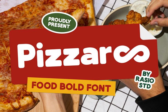
20+ Delicious Fonts for Food-Themed Designs
With the right font, you can make any food-themed design look as good as it tastes. In this roundup of the best fonts for food-themed designs, you’ll discover typefaces that bring flavor to your visuals. Each font captures the...
4 days ago
1
60 Recommended Fonts for PowerPoint Presentations
Picking the right font for your presentation is probably the most important part of designing a PowerPoint slideshow. If your font isn’t readable, you’ll have a confused audience. We explored the web to find this collection of the best...
4 days ago
3

WordPress.com Changelog: A Resizable Editor and Sh...
Updates that let you size the editor to any screen, crop images more precisely, and edit icons — plus some reliability fixes.
1 week ago
5

When It Makes Sense To “Block” The Main Thread
The common rule of thumb is to never “block” the browser’s main thread when running JavaScript tasks. But is this a hard rule? Victor Ayomipo describes a use case he encountered involving a screenshot extension where he made an...
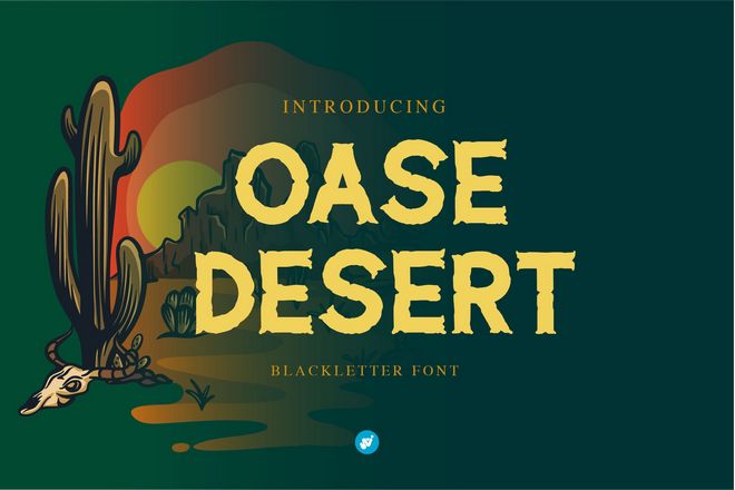
20+ Awesome Desert Fonts for Wild Aesthetic Design...
Desert-inspired fonts bring a rugged, wild aesthetic that instantly evokes wide open landscapes, sun-soaked horizons, and adventurous energy. What makes desert fonts so striking is their character and how they combine bold letterforms with weathered textures, rustic serifs, or...
1 week ago
4
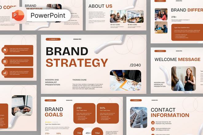
20+ Trustworthy Brand Strategy Presentation PowerP...
A well-crafted brand strategy deserves a presentation that guides your audience through ideas with ease. This roundup highlights PowerPoint templates built for direction, logic, and visual flow. Each template supports strategic thinking by creating clear spaces for objectives, insights,...
1 week ago
4
20+ Trustworthy Gold Foil Logo & Business Card Moc...
Few design elements communicate luxury and professionalism as effectively as gold foil. Gold foil instantly elevates your brand identity, making it look more premium and memorable. But showing that off to clients or in your portfolio requires more than...
1 week ago
5
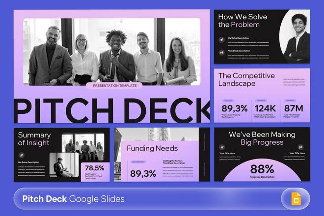
20+ Trustworthy Pitch Deck Templates for Google Sl...
Creating a strong pitch deck starts with choosing the right design foundation. Pitch deck templates for Google Slides are built to help you structure your presentation in a clear and engaging way. Instead of worrying about layout and formatting,...
1 week ago
7
20+ Beautiful Handwriting Fonts for Students & Tea...
Handwriting fonts are a great way to add personality and warmth to educational materials. Unlike traditional typefaces, these fonts recreate the fluid strokes and subtle imperfections of real handwriting. This makes designs feel more human, friendly, and approachable for...
1 week ago
6
20+ Handpicked Fonts for Subtitles & Subheadings
Subtitles and subheadings are the quiet heroes of great typography. They guide readers through content, highlight key sections, and make long layouts feel organized and easy to navigate. Choosing the right font ensures these smaller headings remain clear without...
1 week ago
9

pointer-events
The pointer-events property controls whether an element can become the target of pointer events like clicks, hover states, and other pointer-based events. In other words, it lets you decide whether the browser should treat an element as interactive when...
1 week ago
10

What’s !important #15: Boundary-aware CSS, Time-ba...
Similar to last time, What’s !important #15 is pretty stacked — read all about boundary-aware CSS, making grid lanes accessible, creating time-based web designs, fixing full-bleed CSS, improving customizable select, new web platform features, and more. What’s !important #15:...
1 week ago
8
Popular


3D-printed bridge points the way to greener construction


 English (US) ·